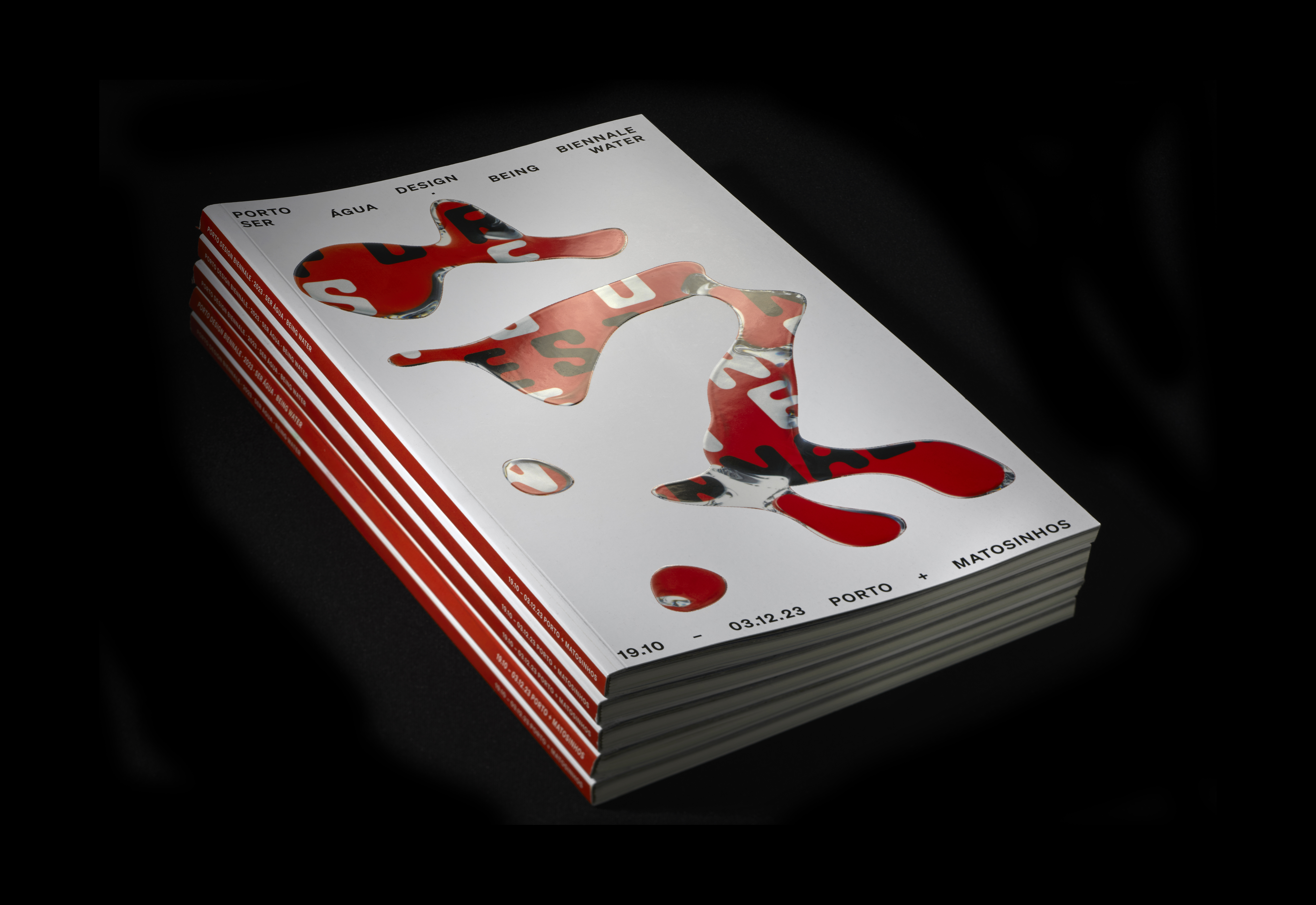
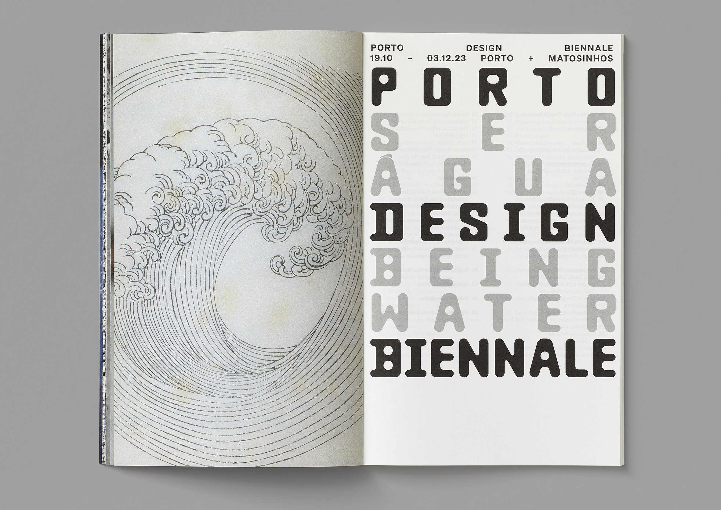
Porto Design Biennale_2023 Edition
Graphic Identity
Certificate of Excellence, International Typographic Awards 2024, ISTD
This project was conceived and designed in partnership with Portuguese graphic designer André Cruz.
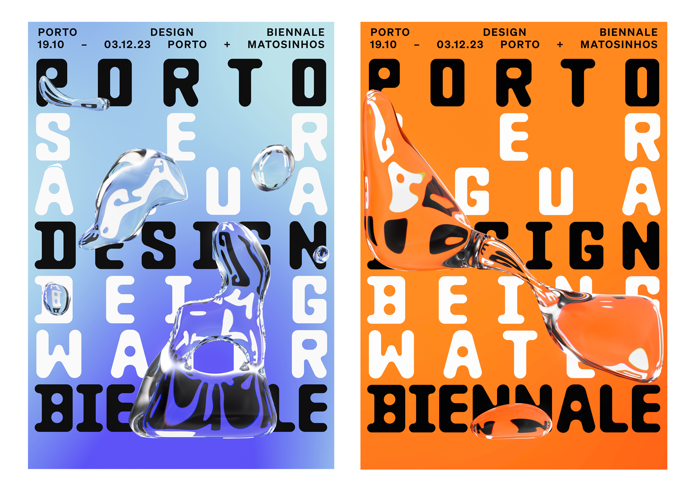
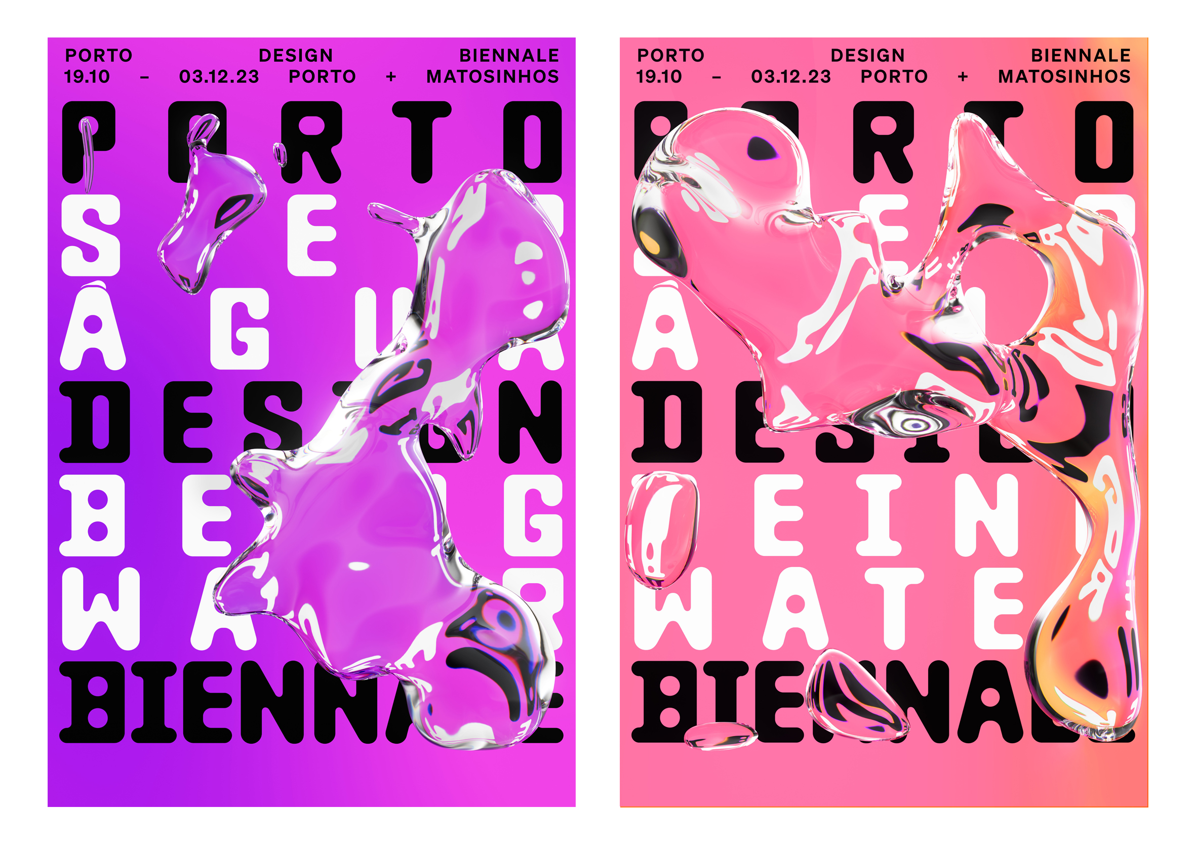
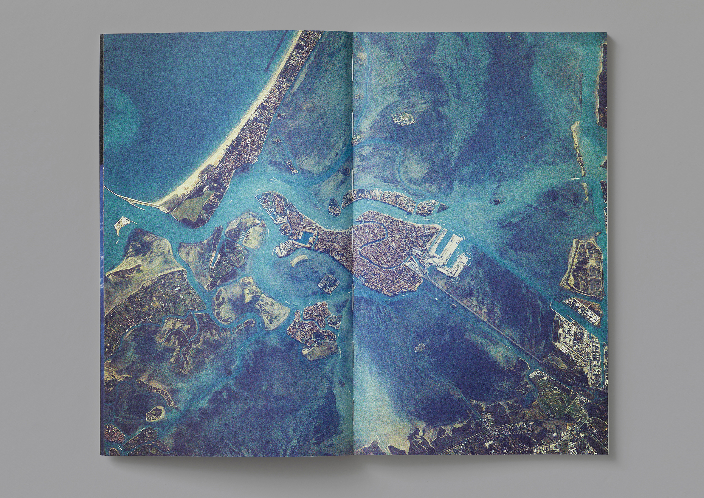
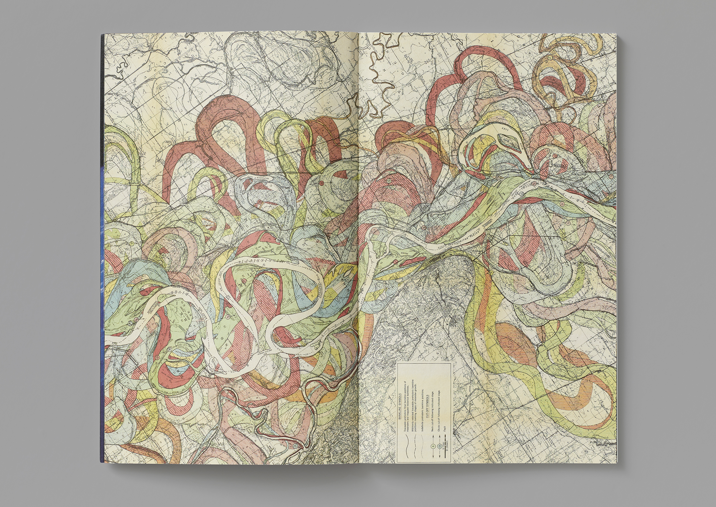
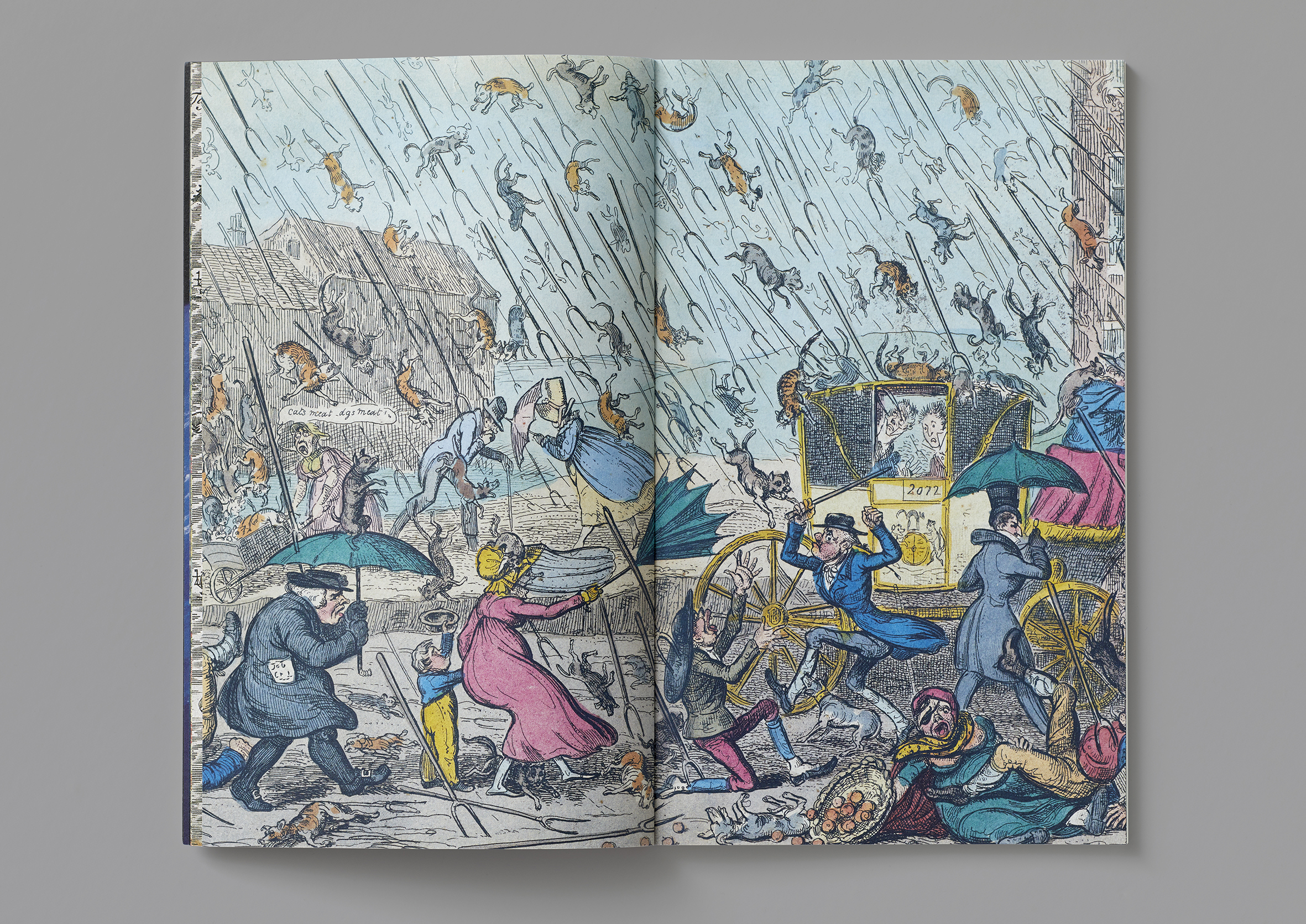
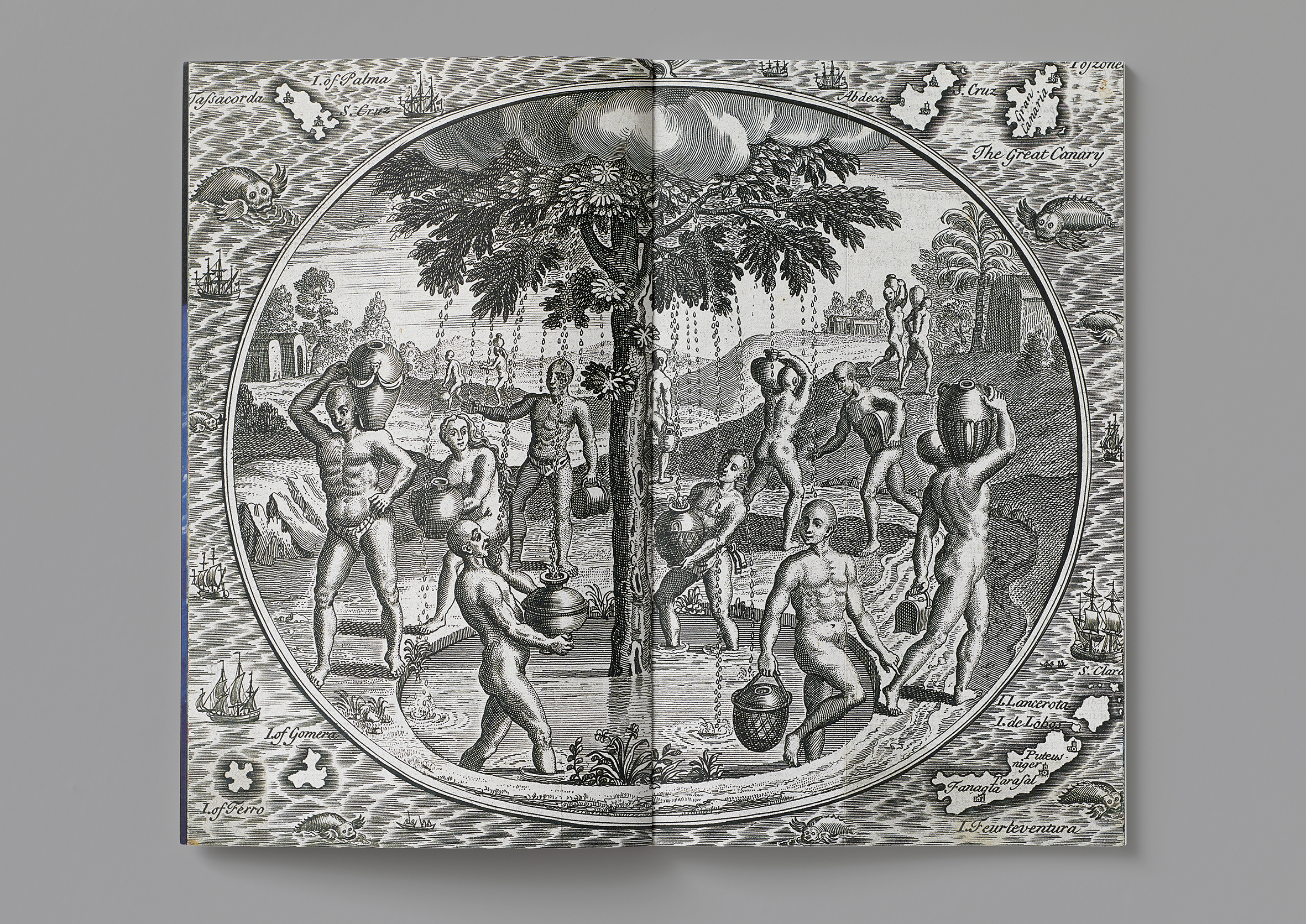
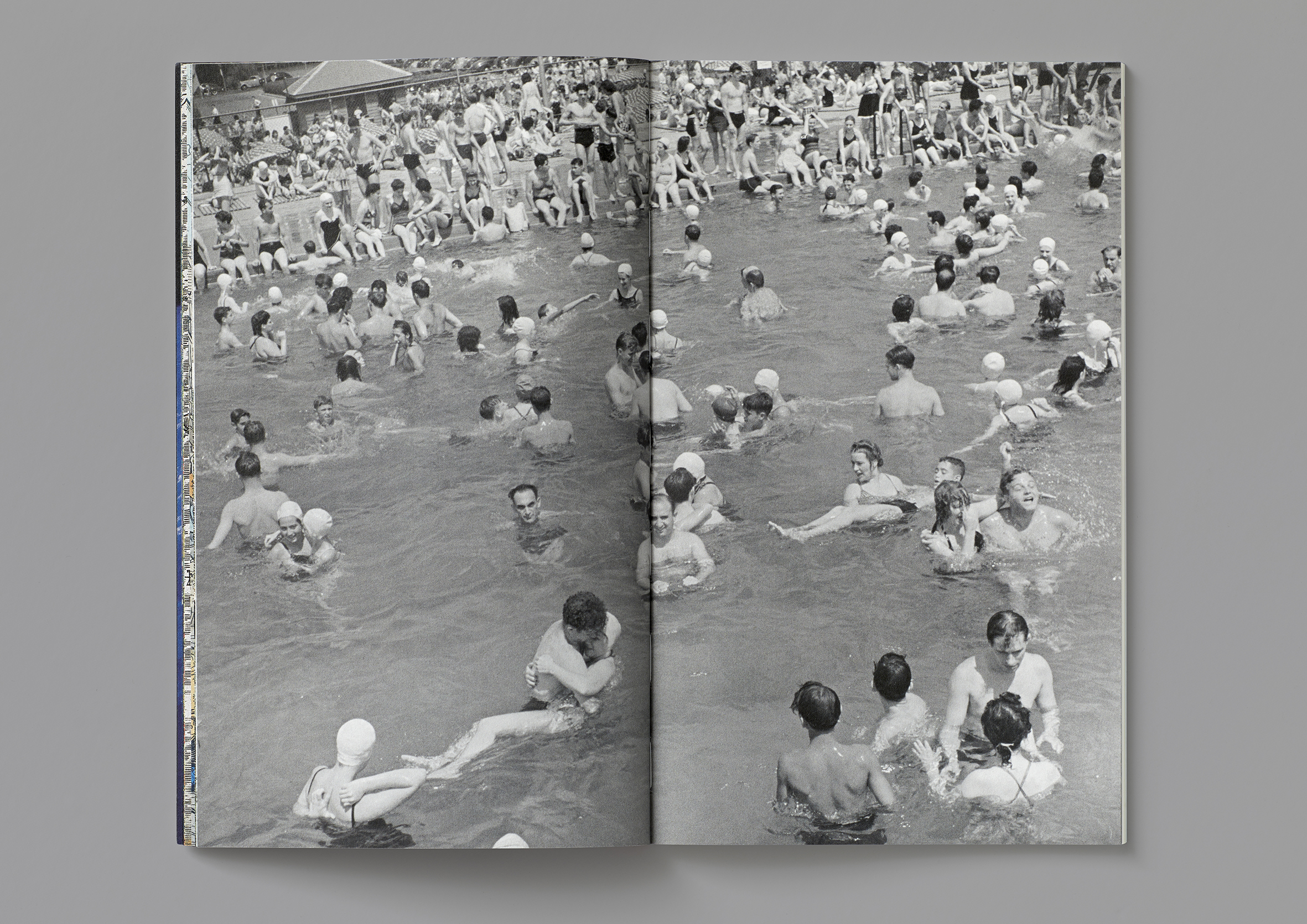
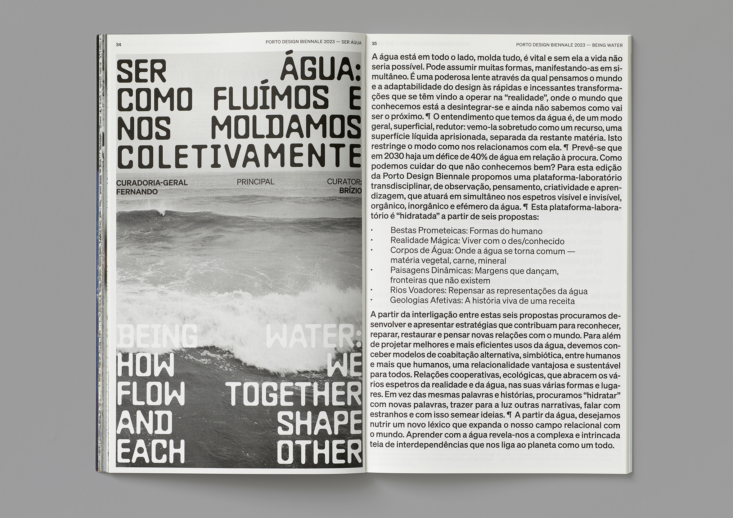
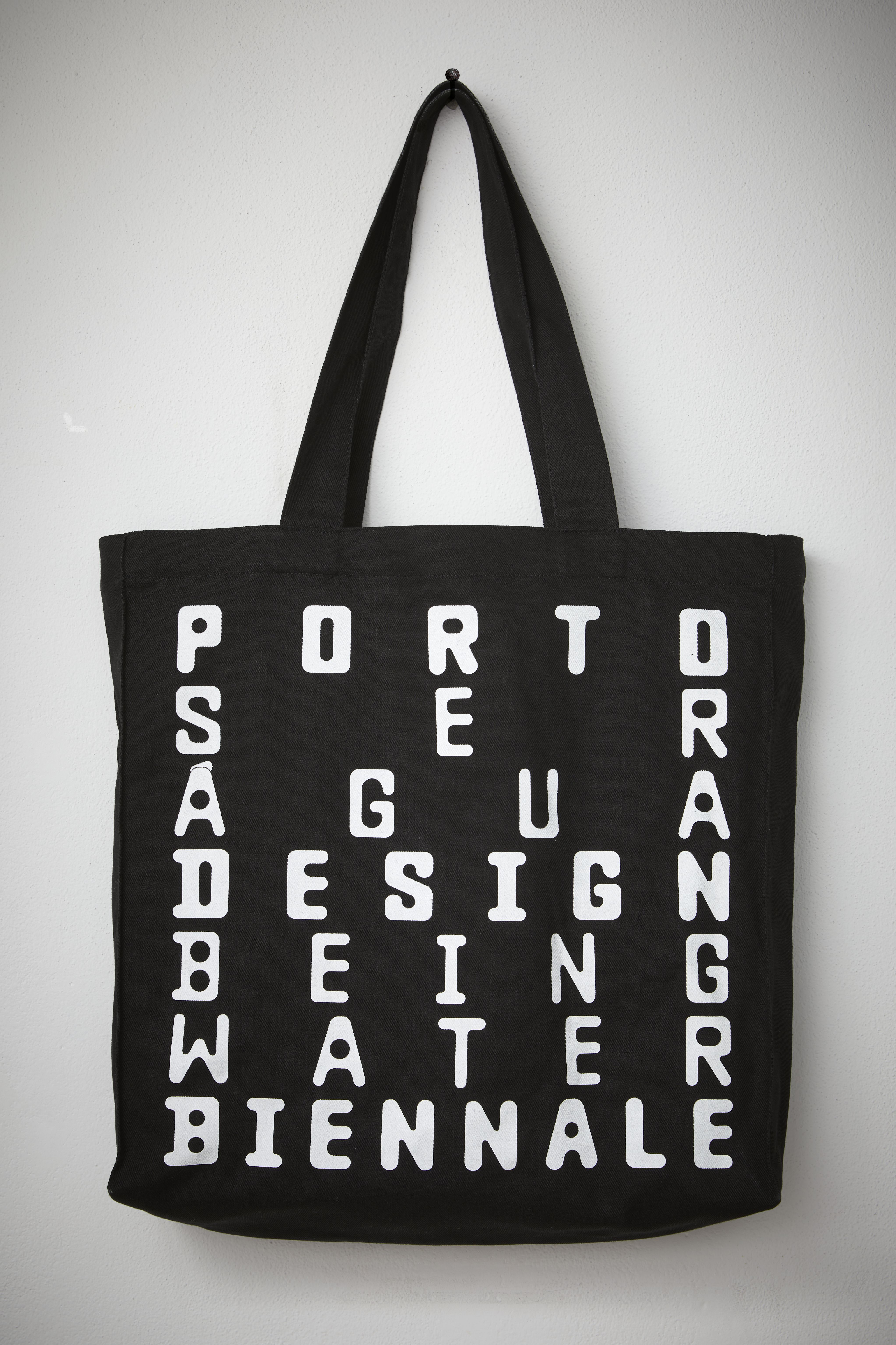
The theme of the 2023 Porto Design Biennale was ‘Being Water’. Our design strategy was to use water as a lens, exploring the visual characteristics and qualities of water, as well as historical visual representations of its use and significance. In doing this we created a large archive of visual references.
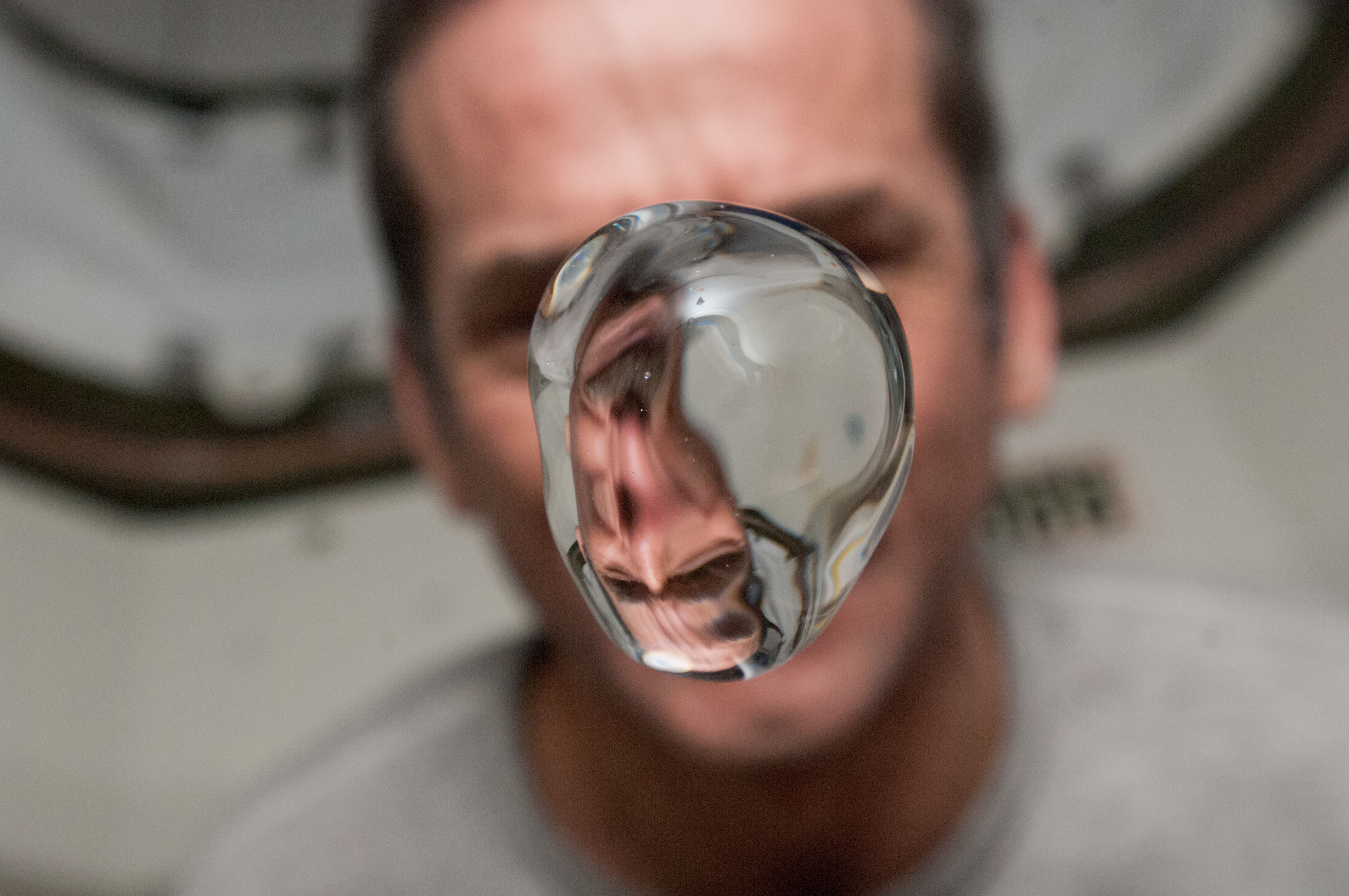
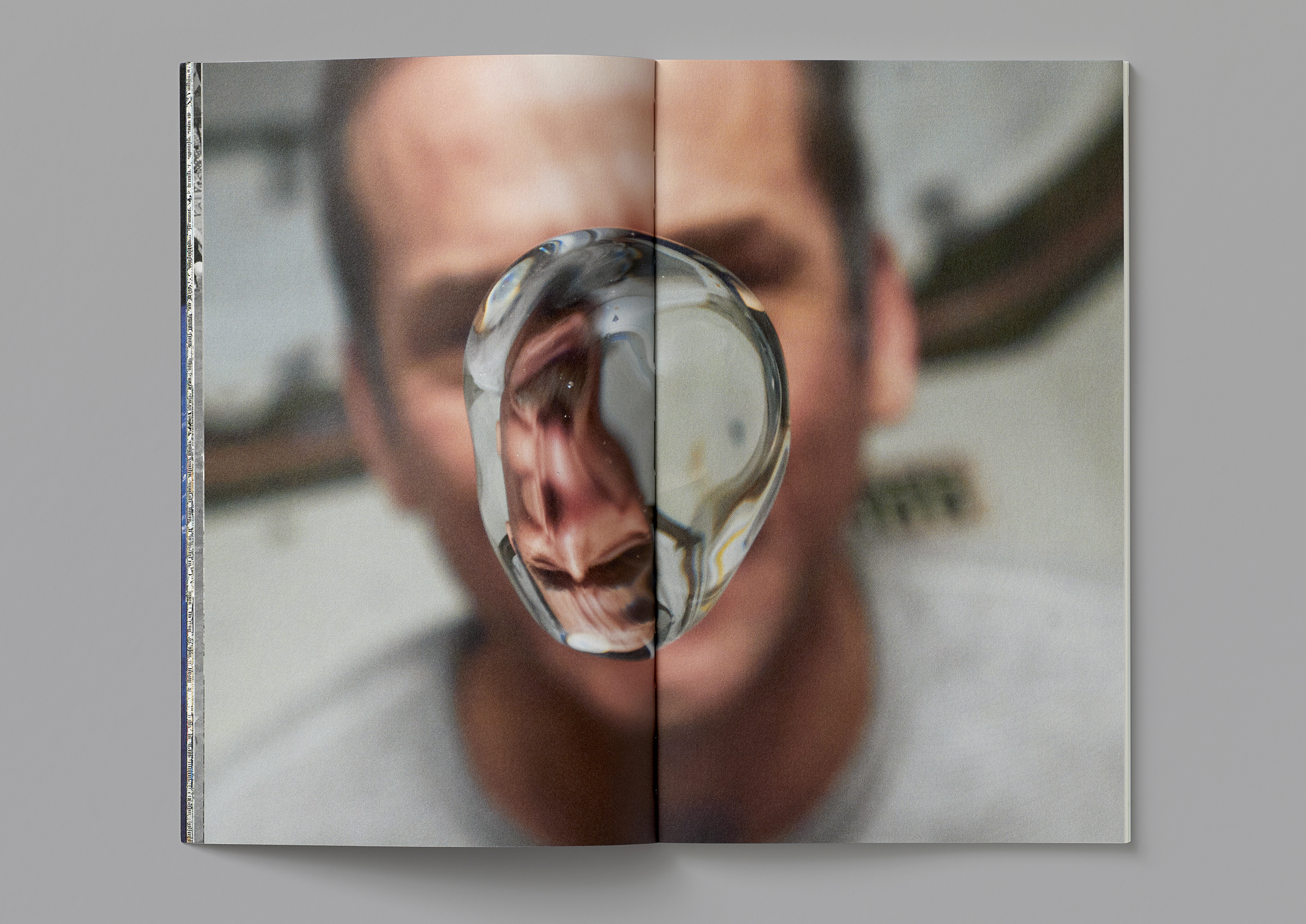
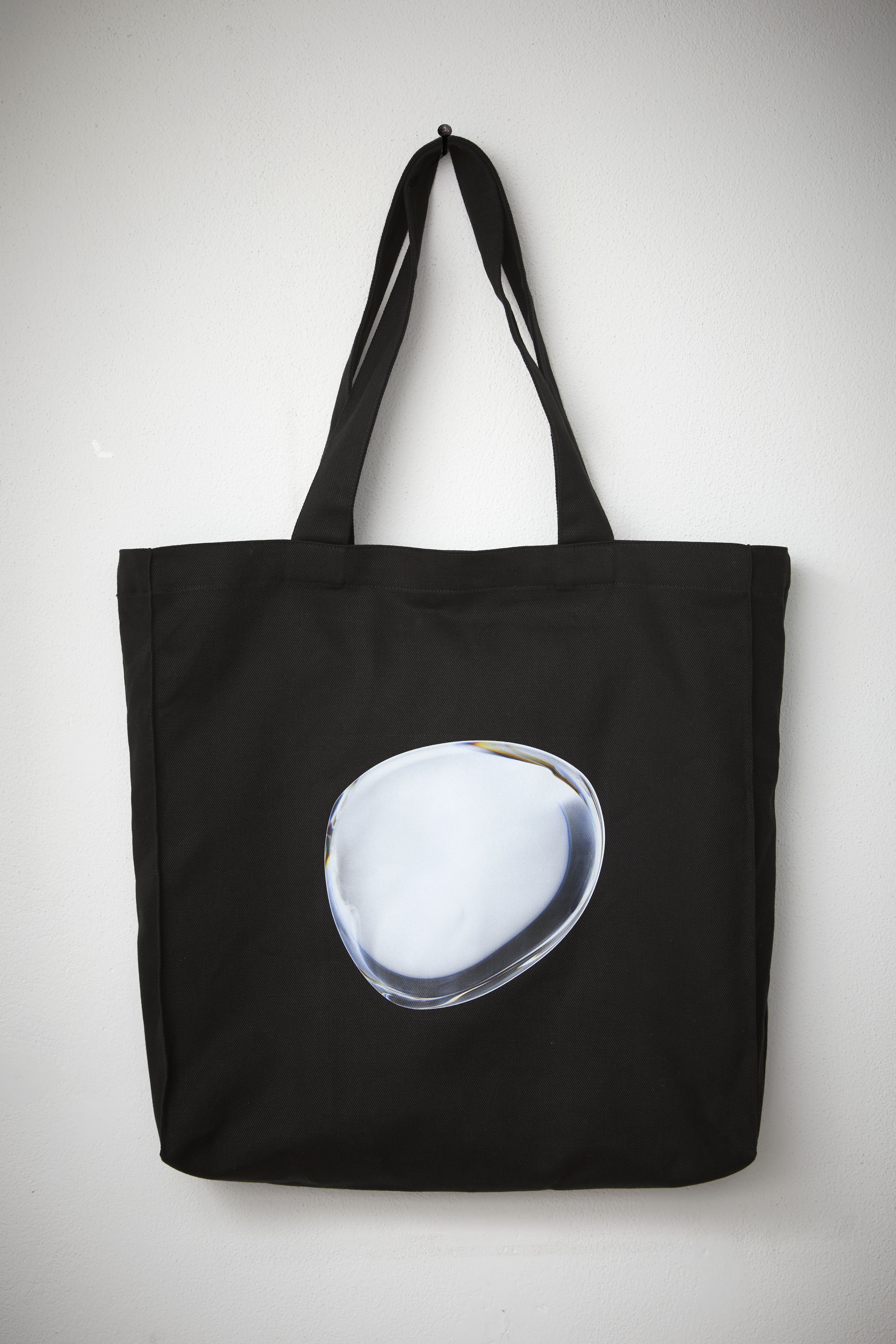
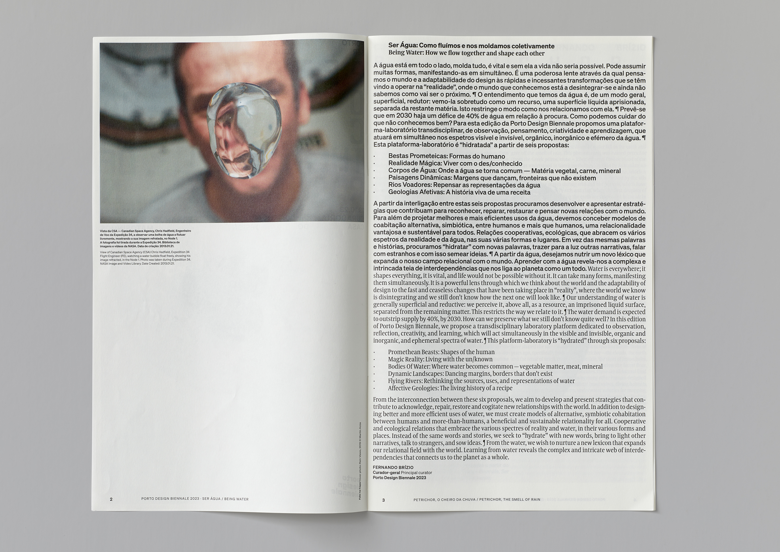
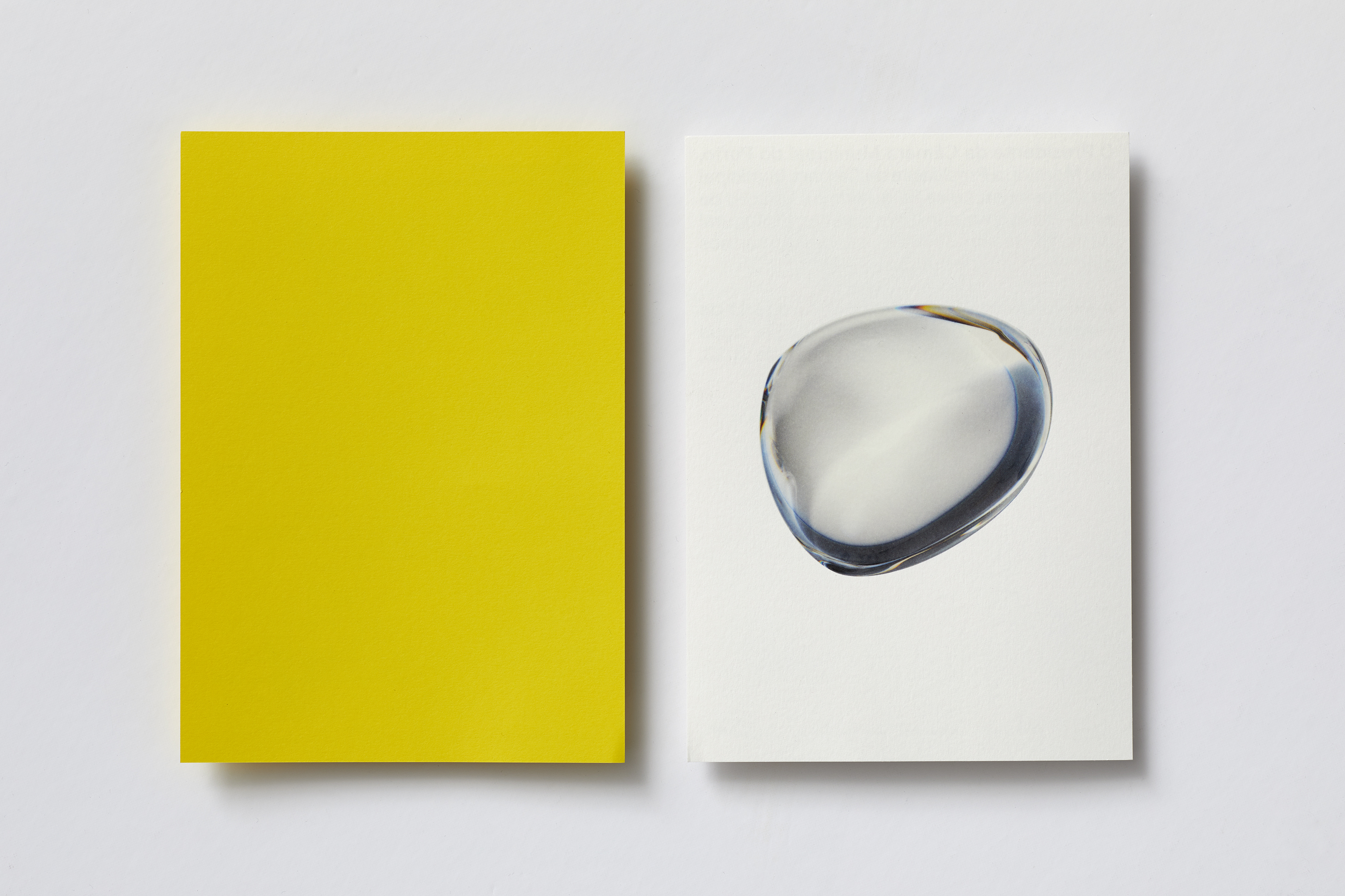
One of many images that caught our attention and inspired our visual experiments, was a photo taken aboard the NASA space station, showing a drop of water floating in zero-gravity atmosphere, thus isolating this familiar life-giving substance in a form that we do not normally encounter.
The idea of a droplet of water operating as a lens became the centre of the visual identity, and in conjunction with a specially selected typeface — Baste A by Lift Type — we created a series of animated poster designs shown in digital displays throughout the city and also applied to a wide range of social media uses. With allusion to the digital frame as a container (aquarium) the type is spaced in a way that fills the space echoing the behaviour of the water droplets that move within and across the frame.
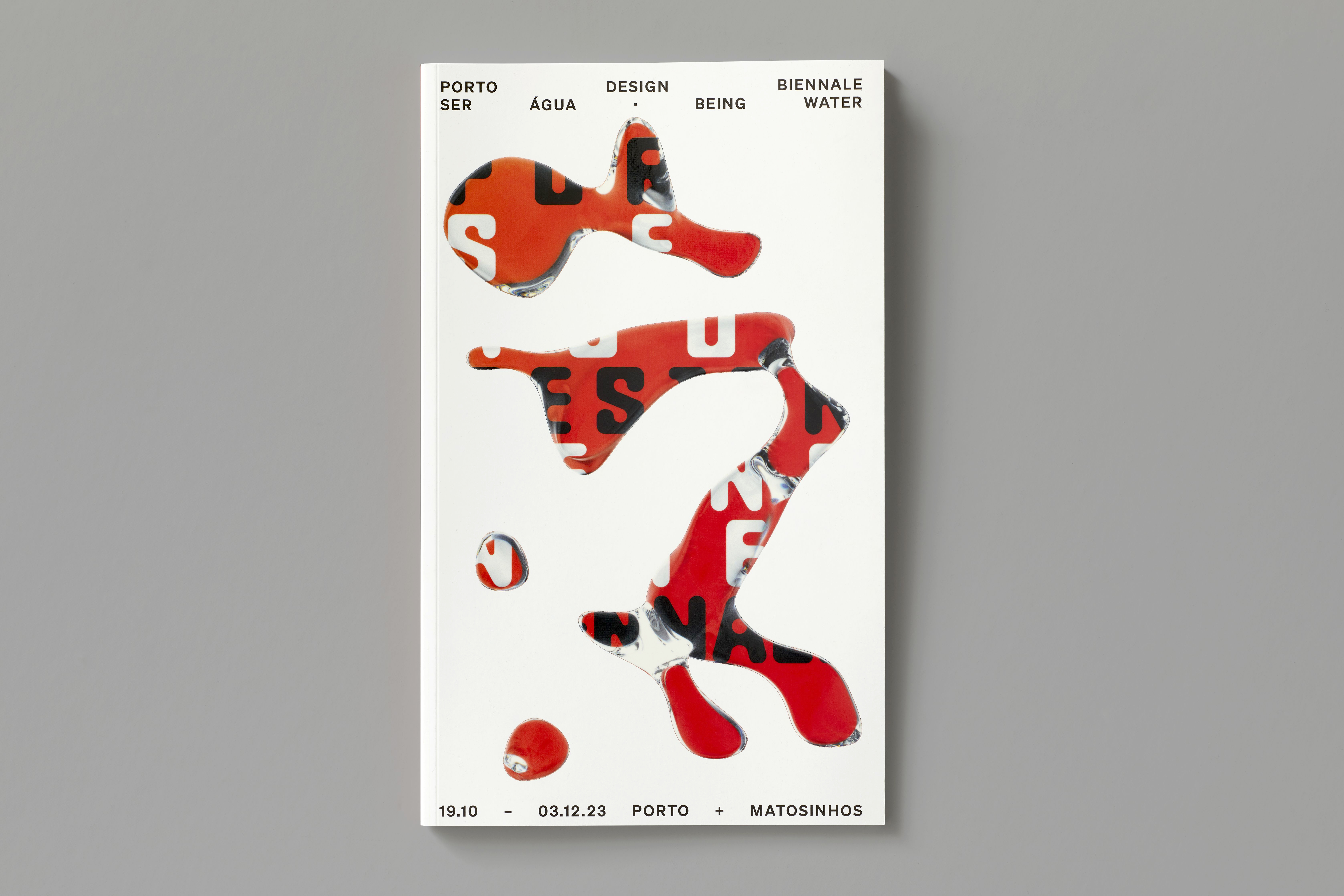
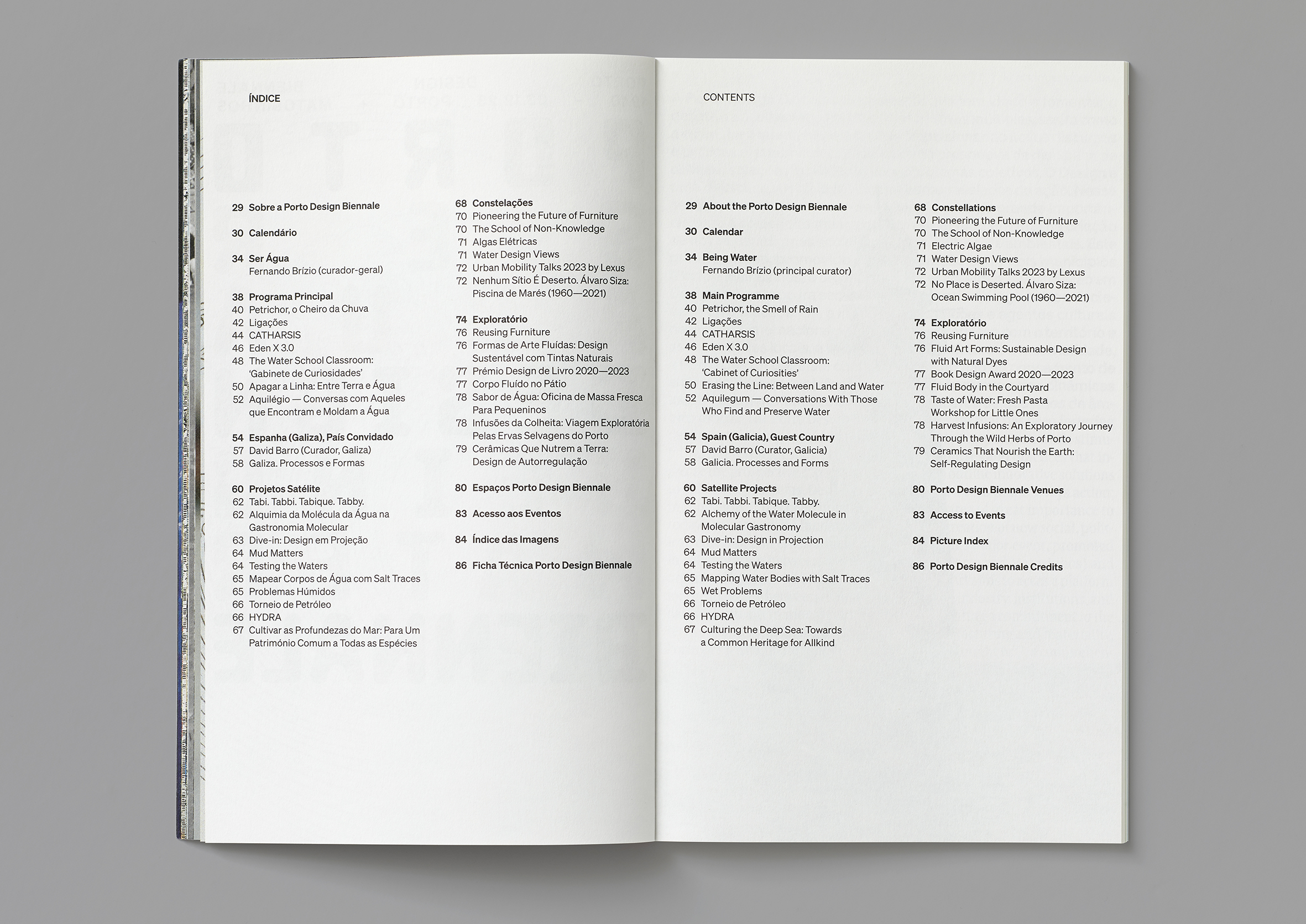
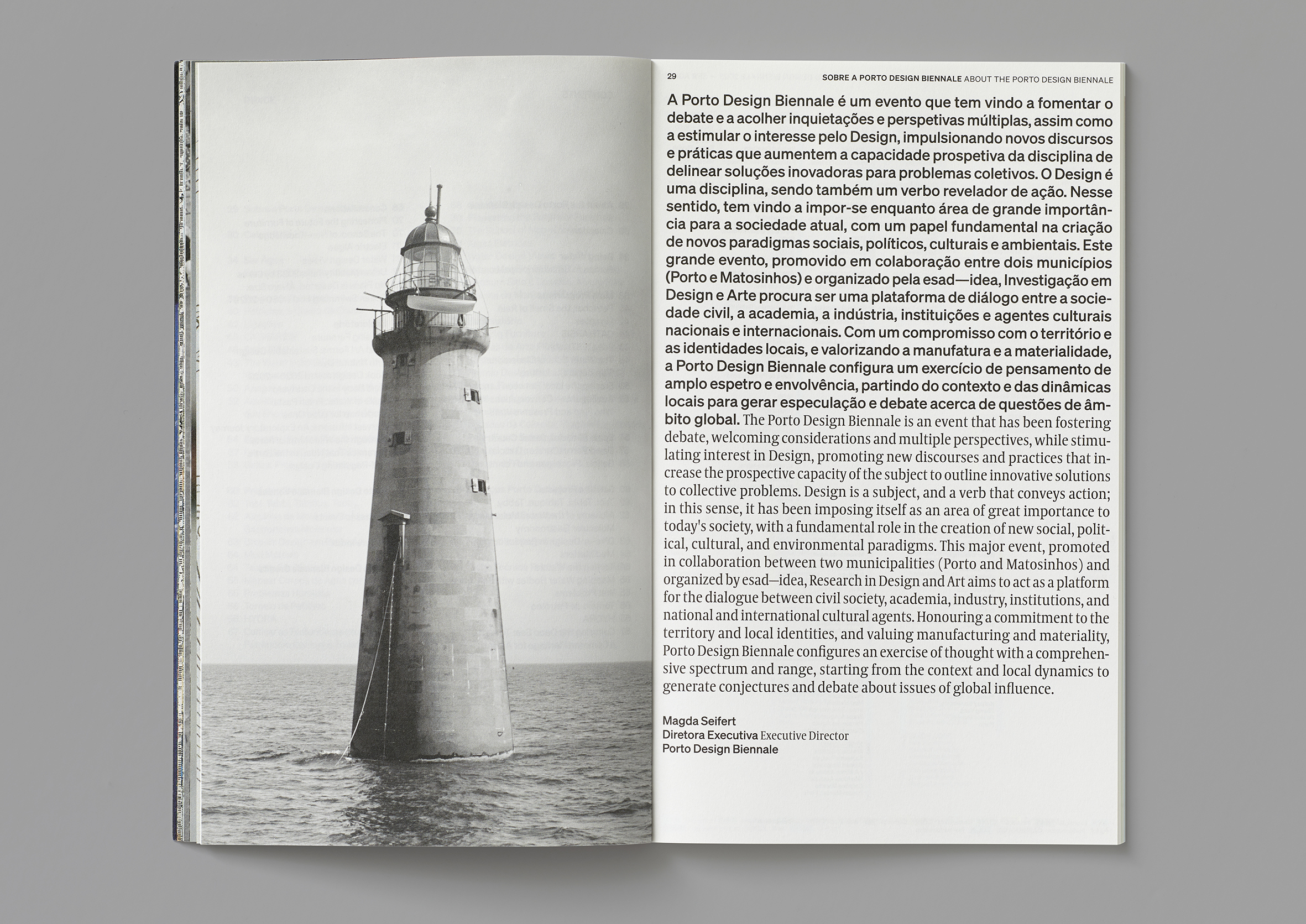
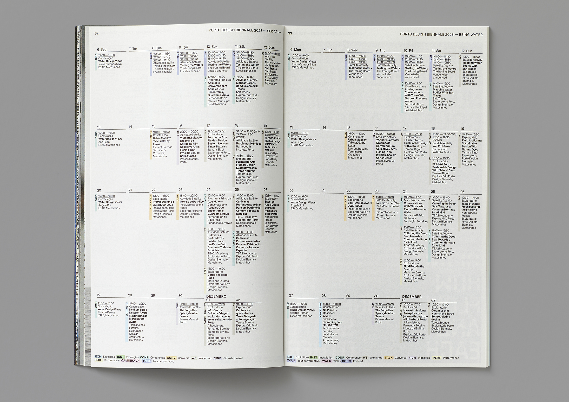
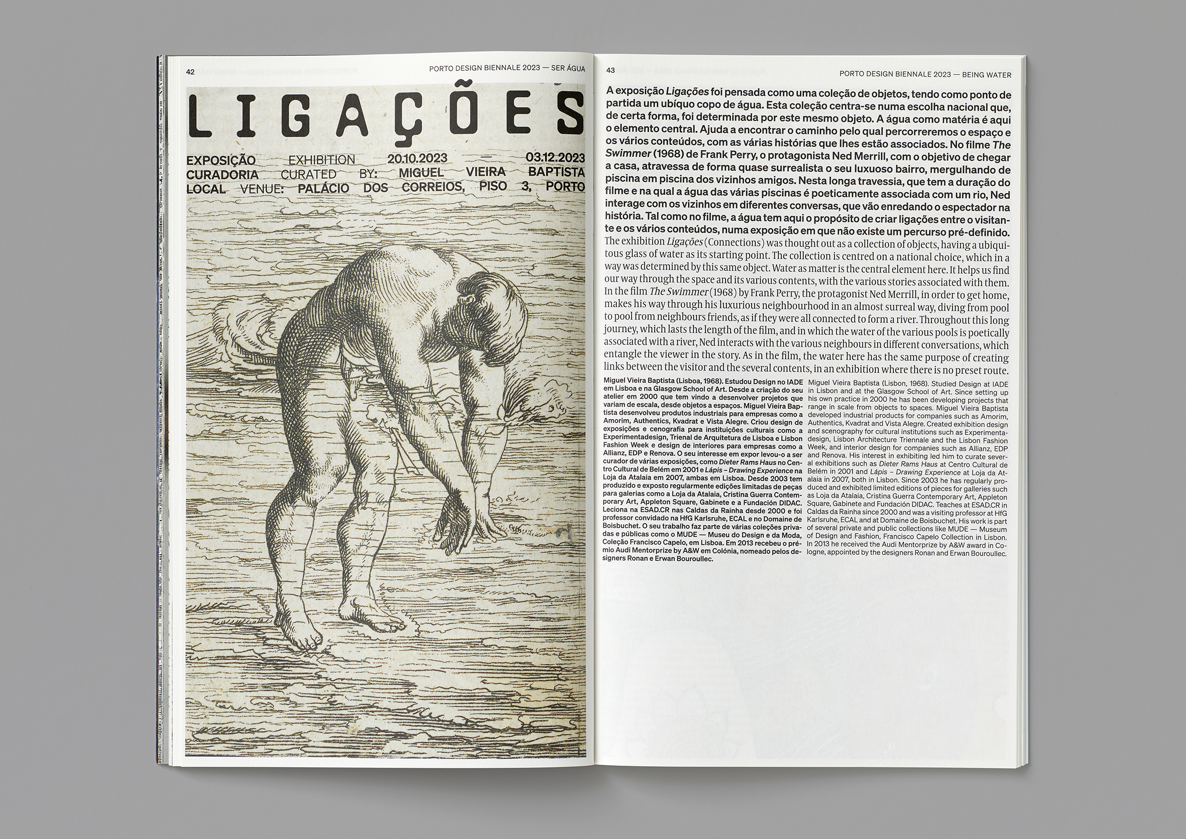
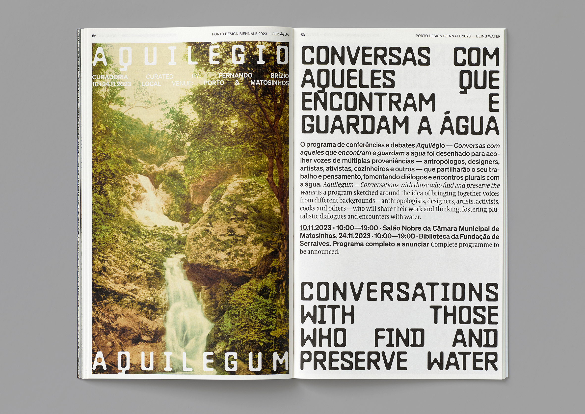
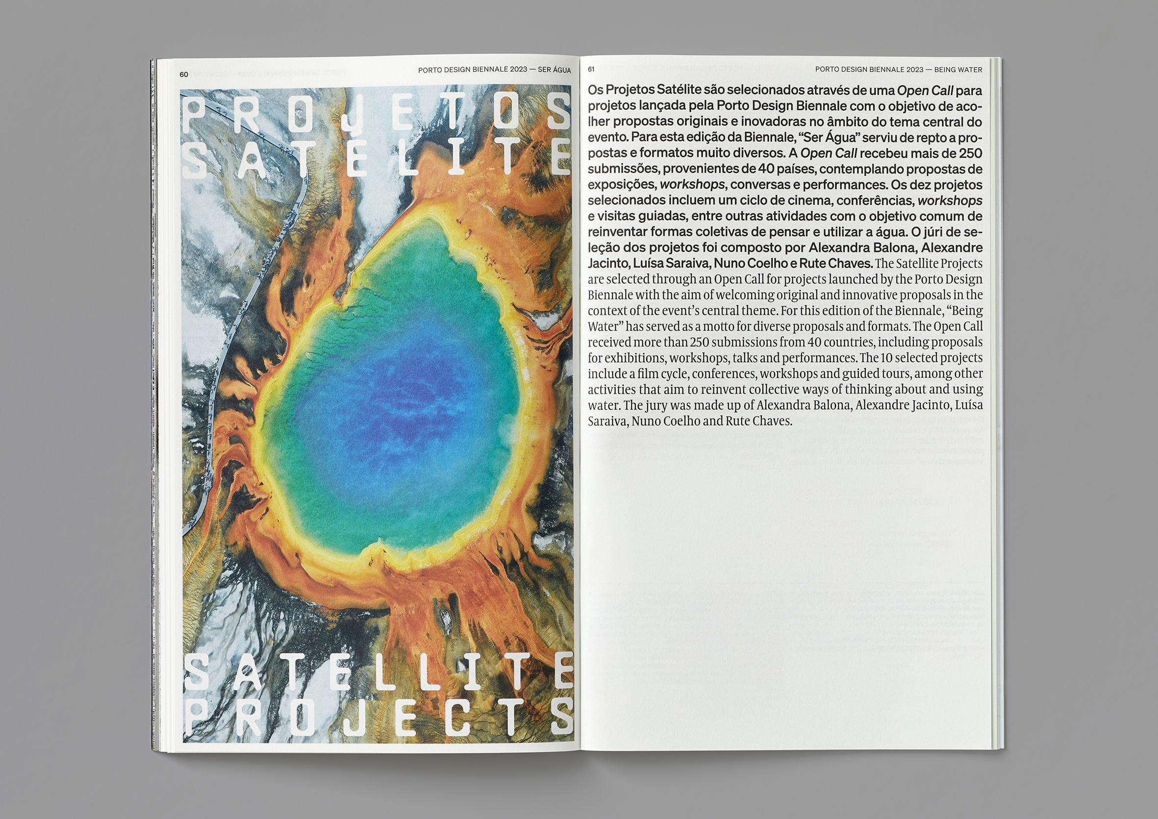
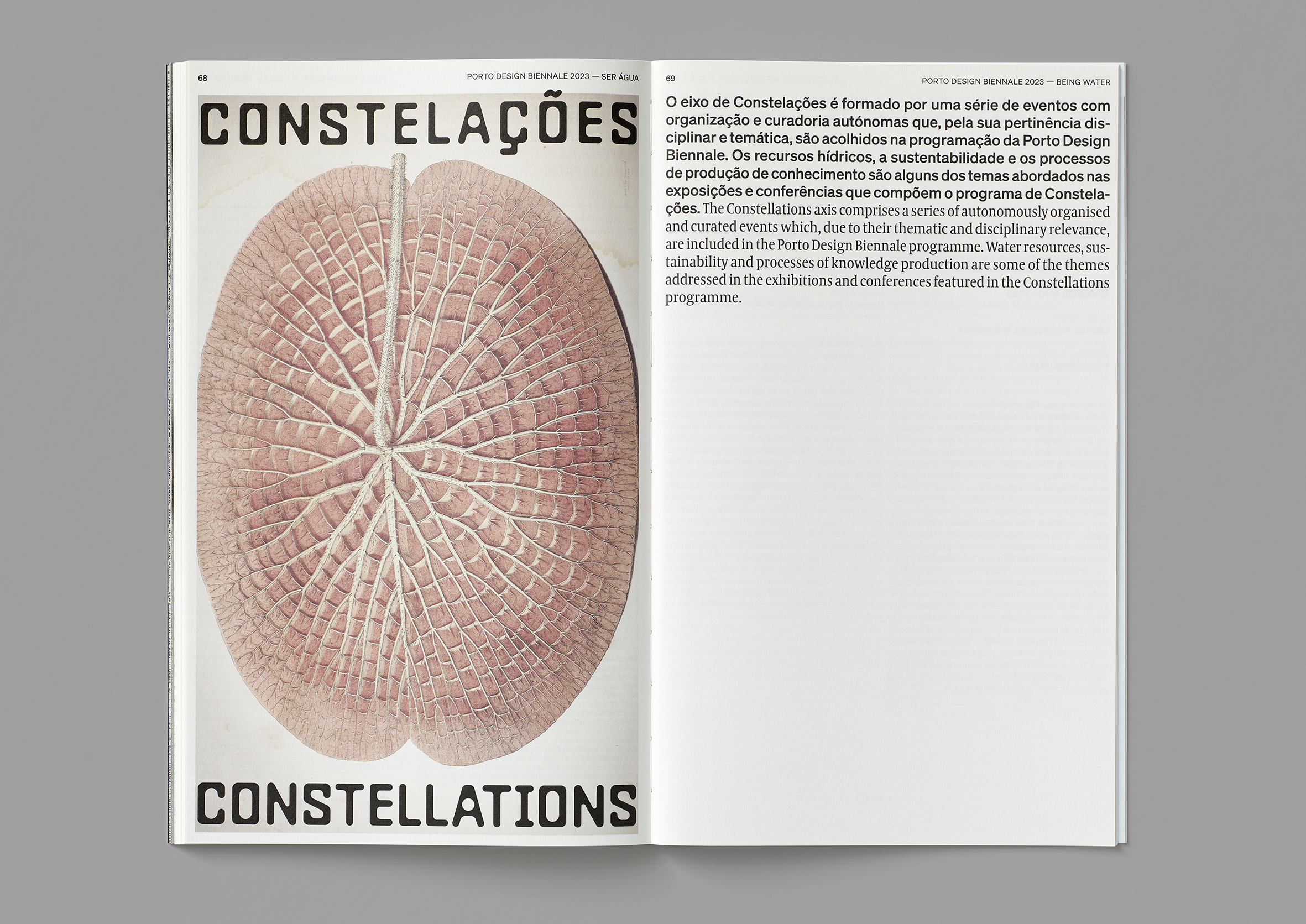
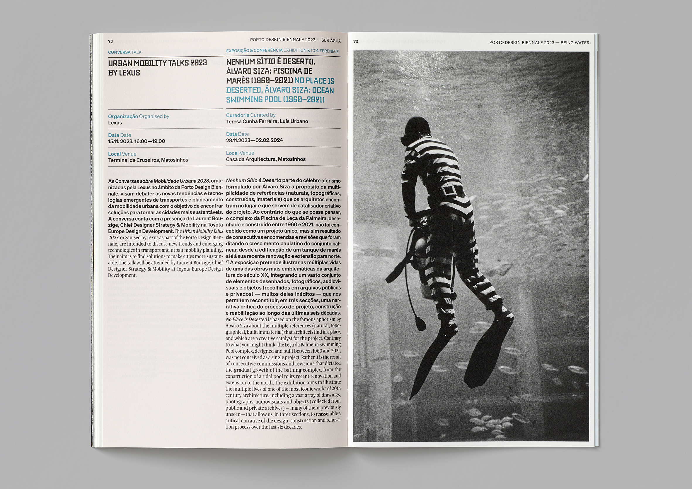
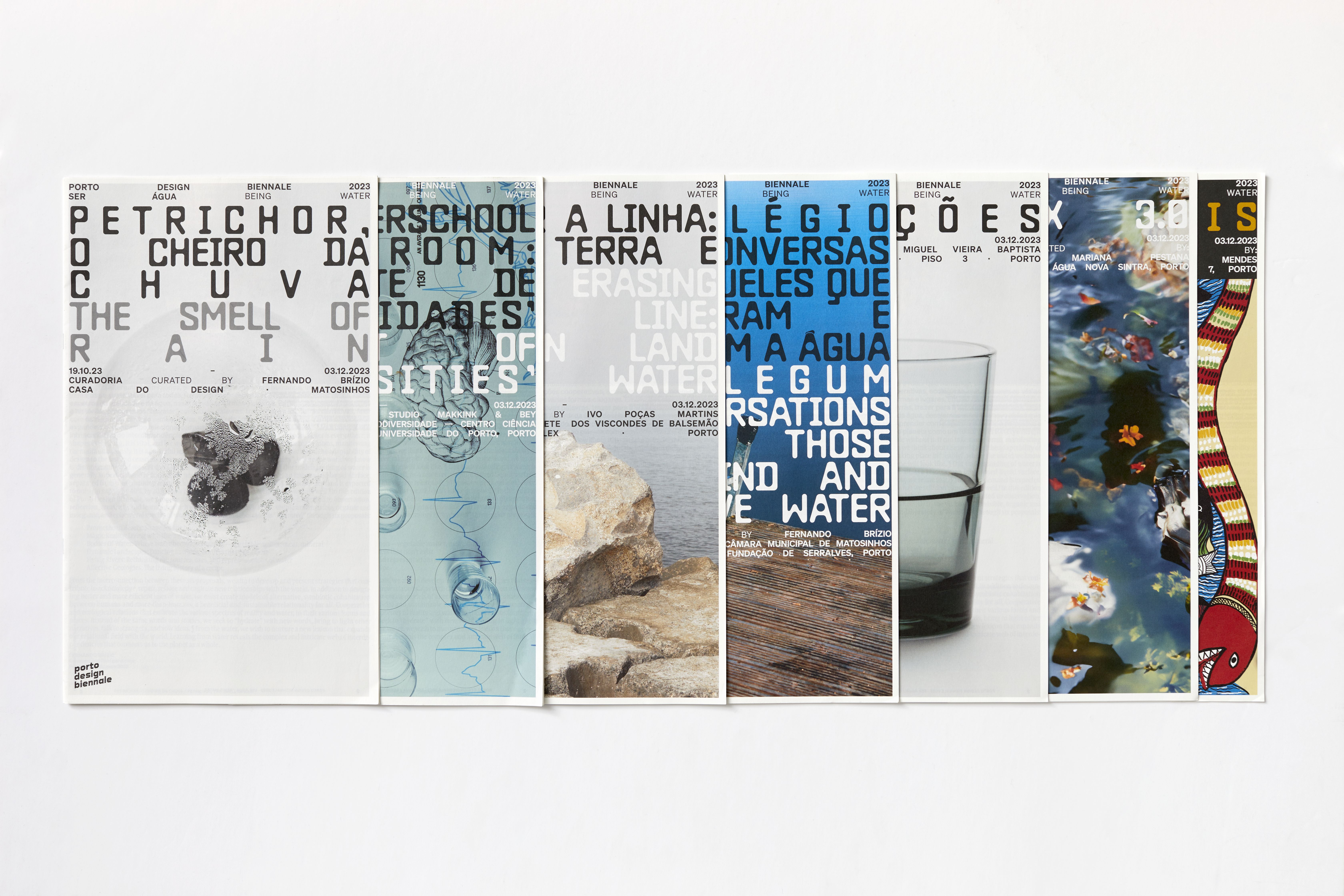
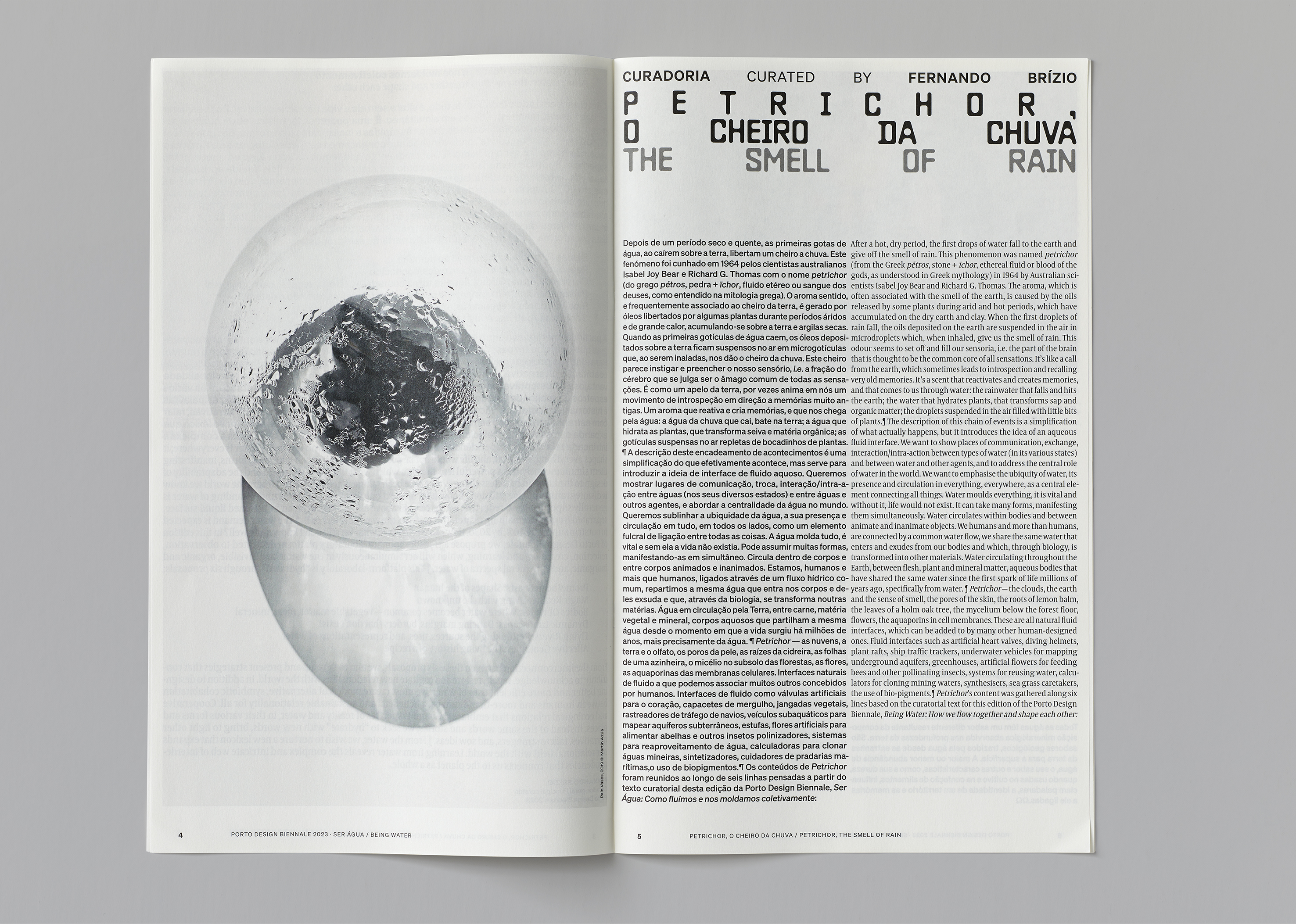
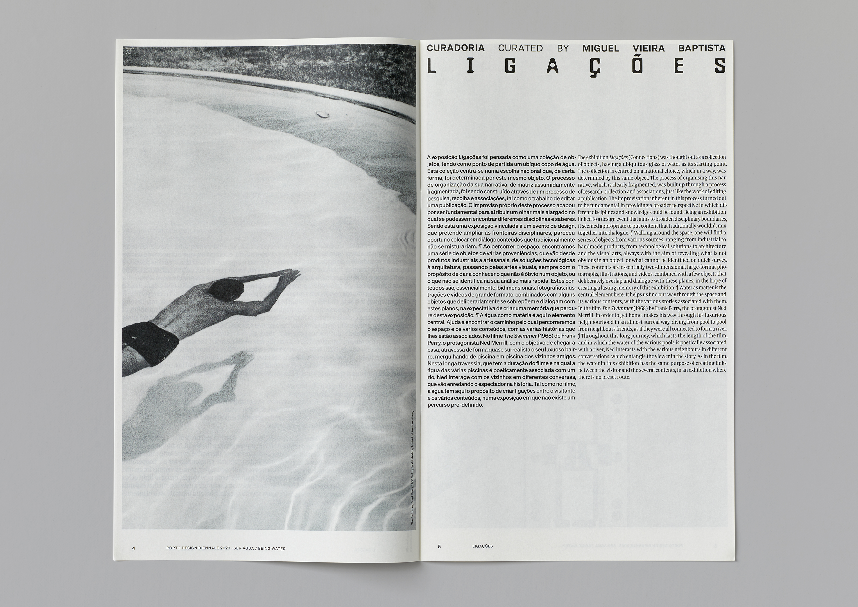
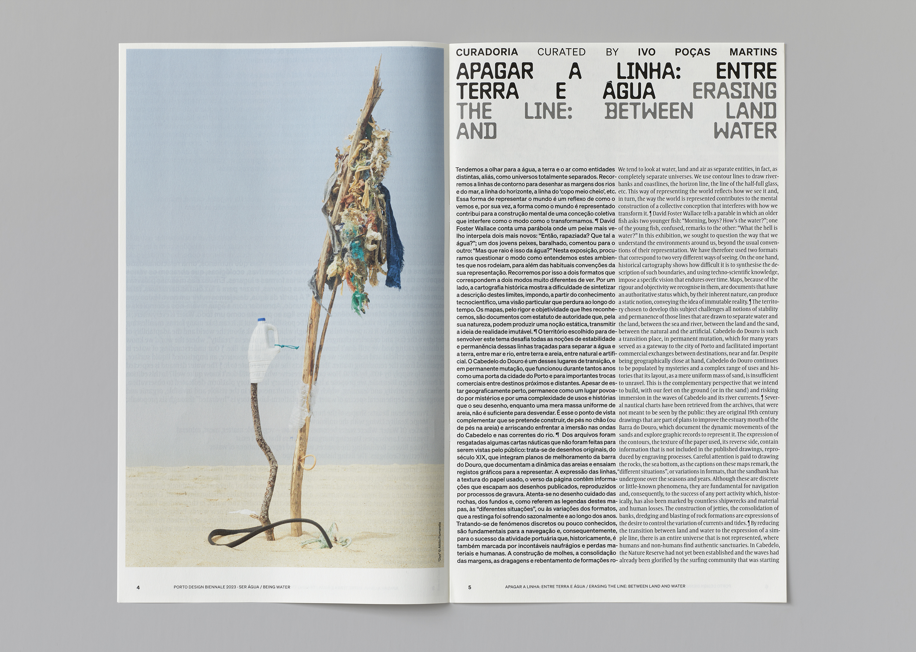
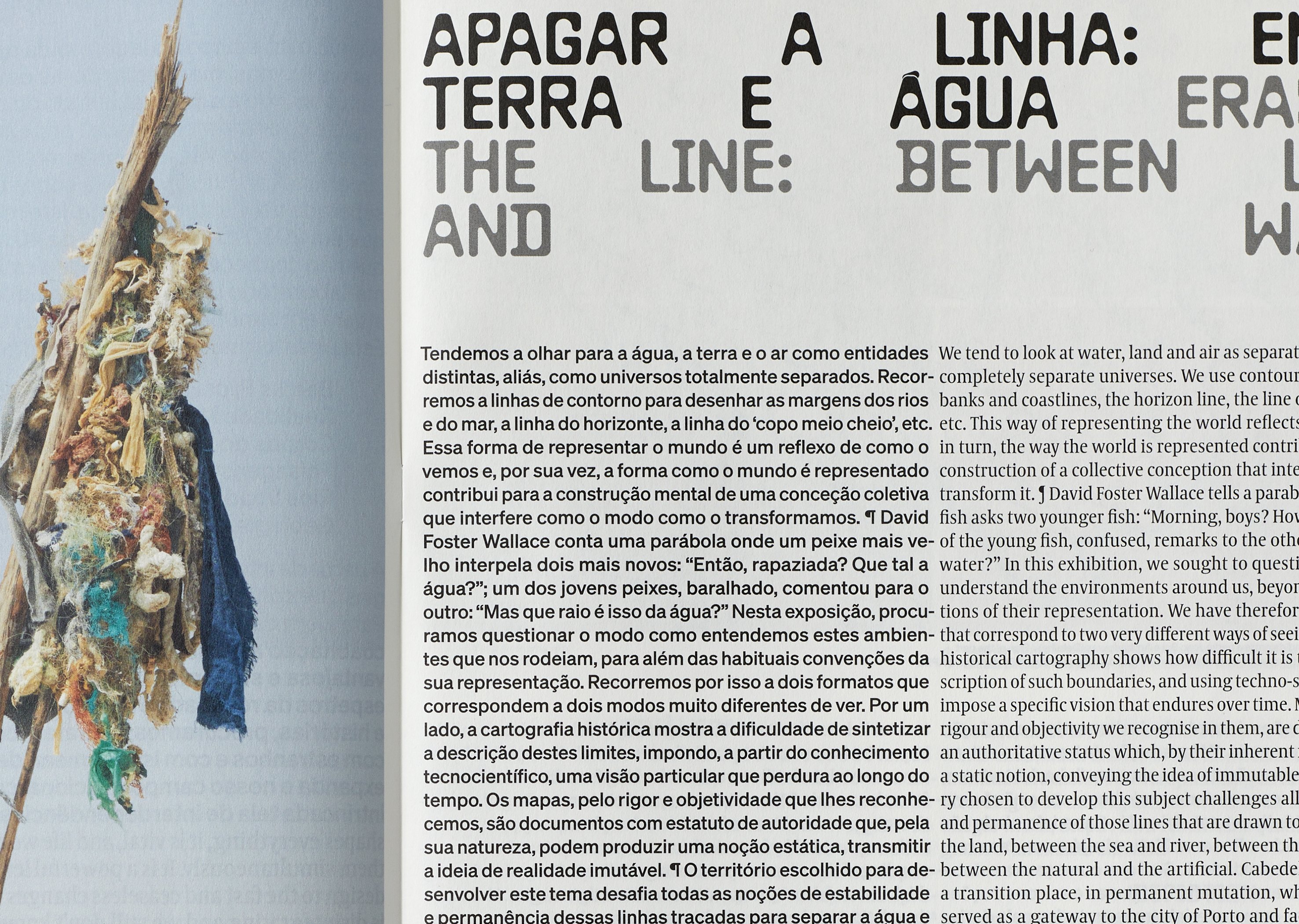
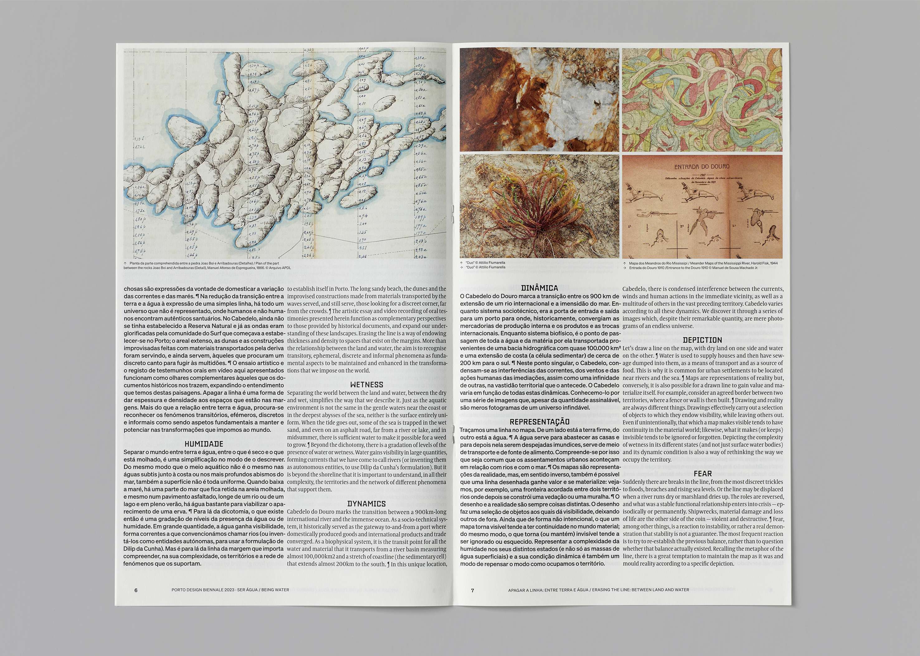
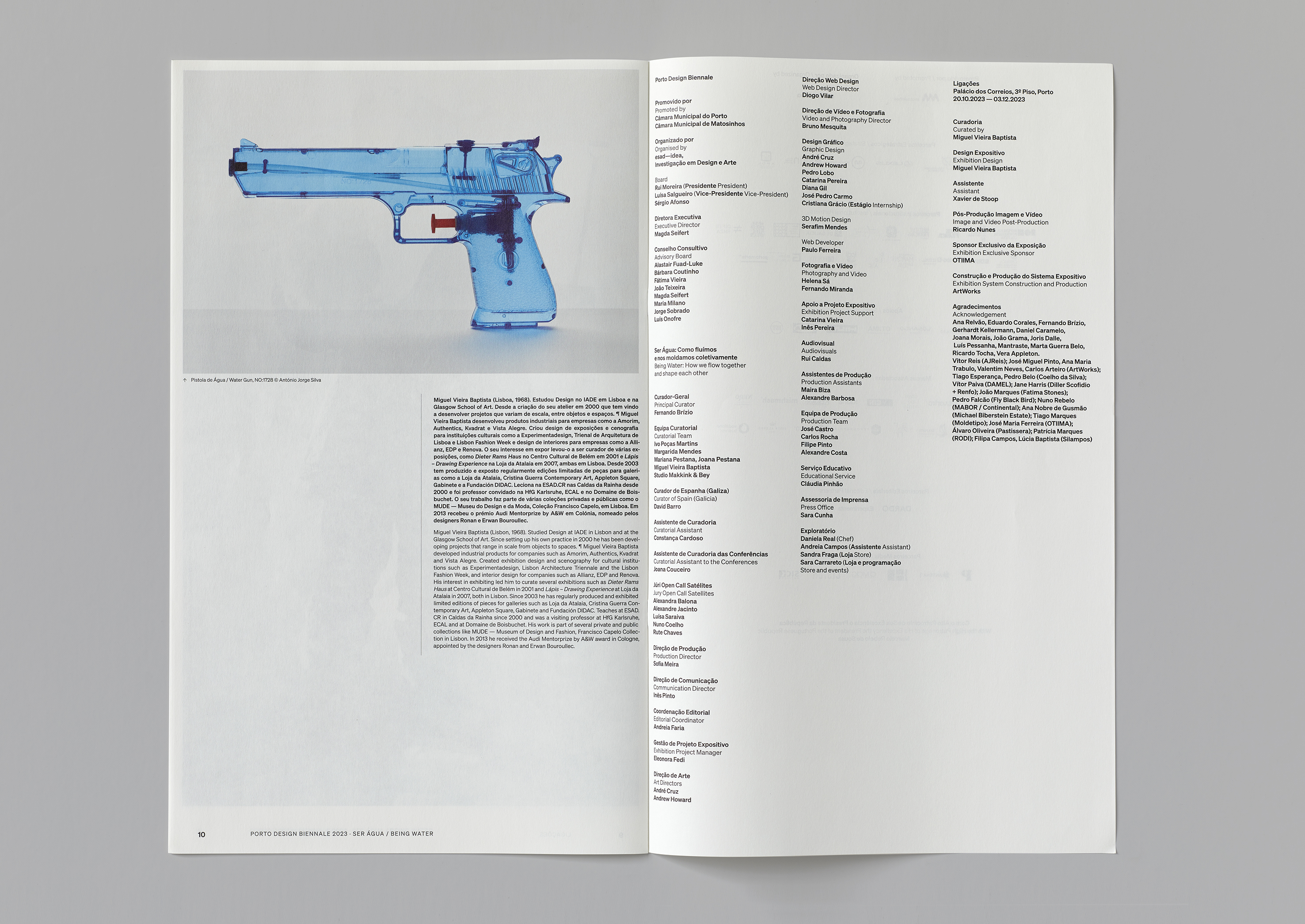
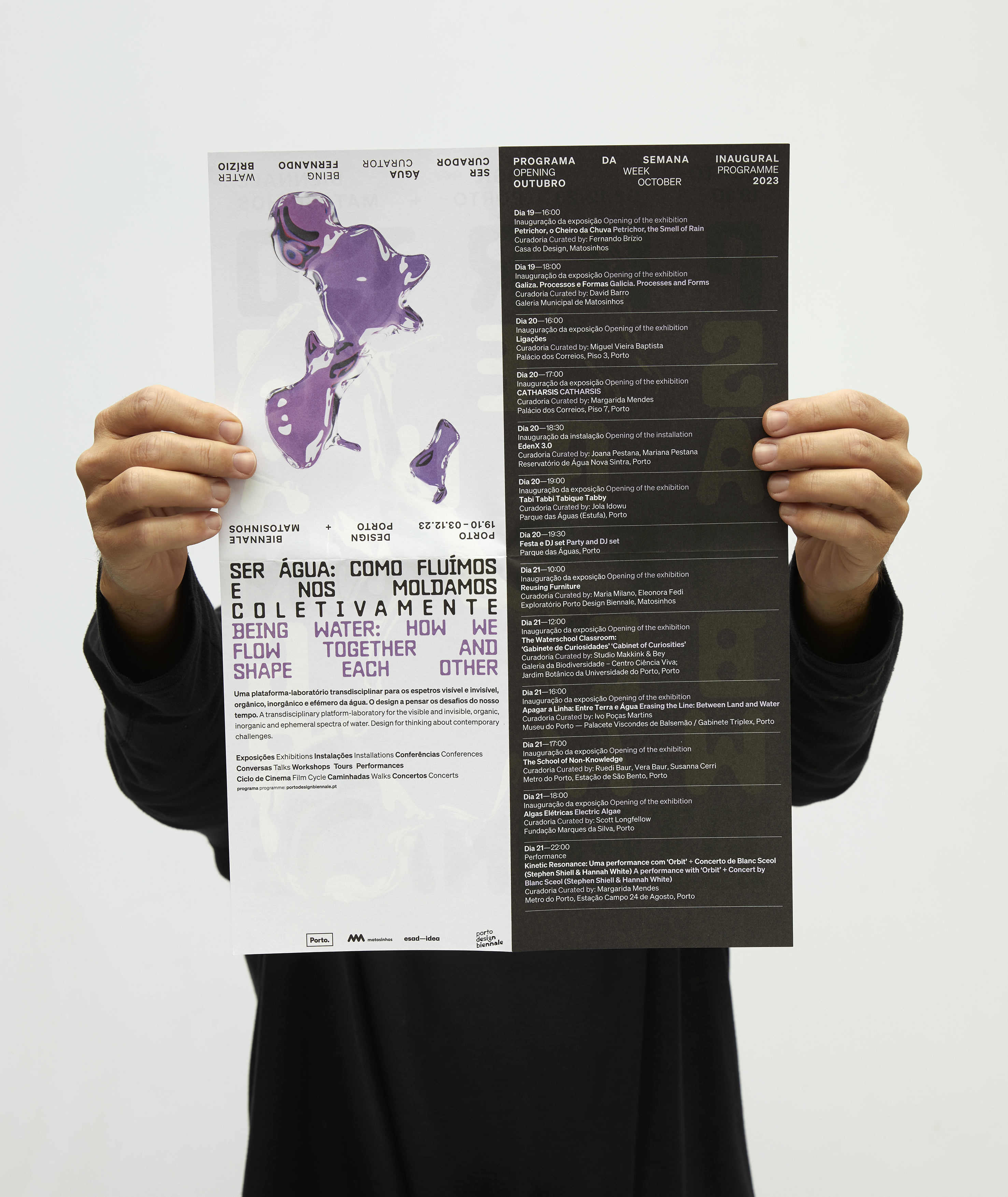
A centre piece of the Biennale materials — the bi-lingual programme — uses a small selection of the visual archive we created and utilises a compact typographic layout. Typefaces: Baste A, Söhne, Coranto.
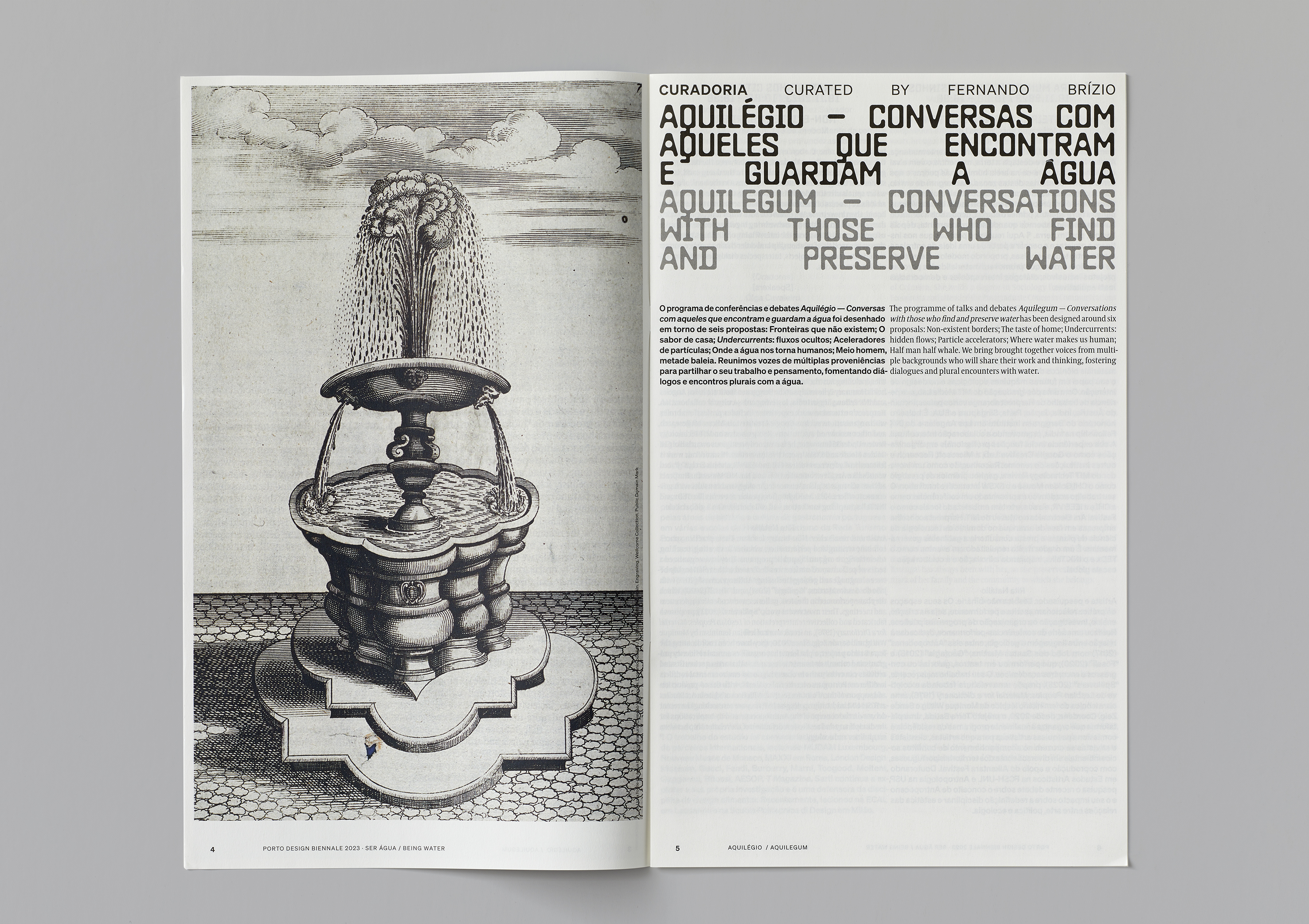
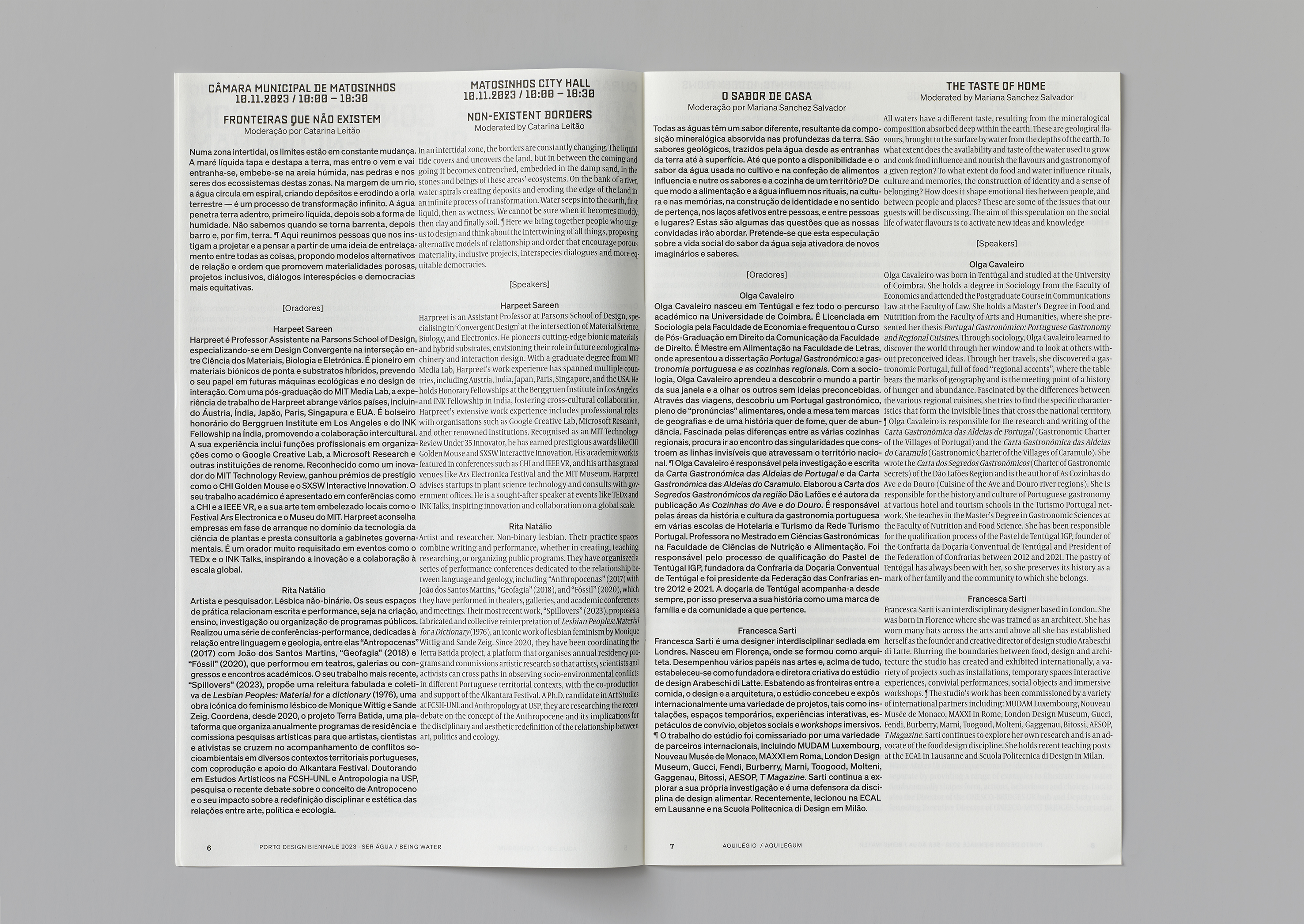
Below: For each of the principle exhibitions (seven in total), we designed a large format 12 page guide.
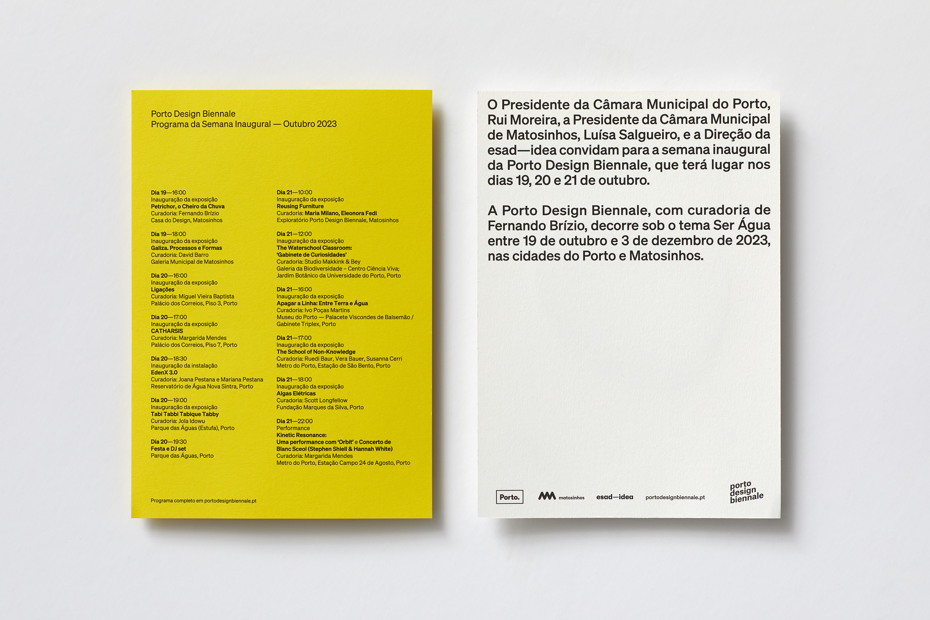
Below: Invitation
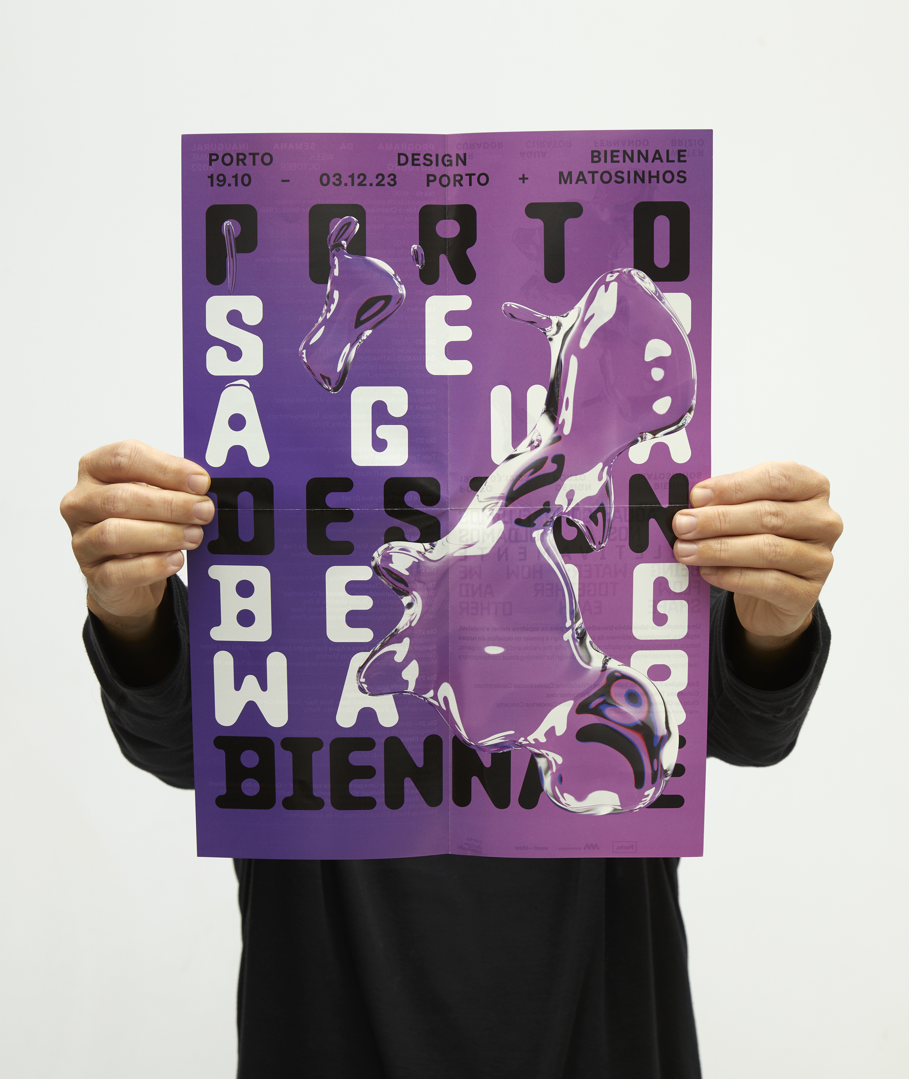
Below: Flyer / Poster
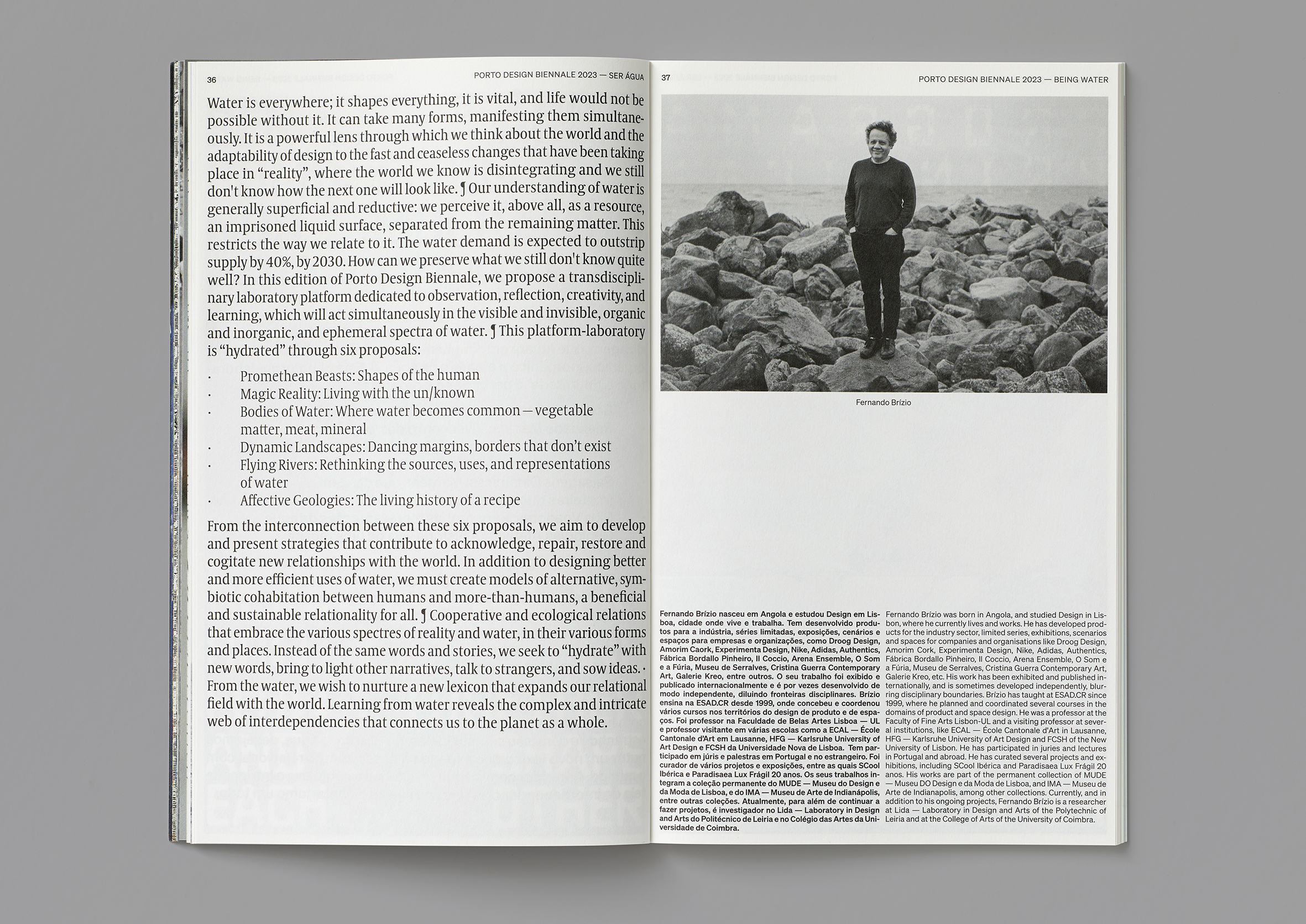
Photos by Filipe Braga.