Idioms Exhibition #3
Alphabet
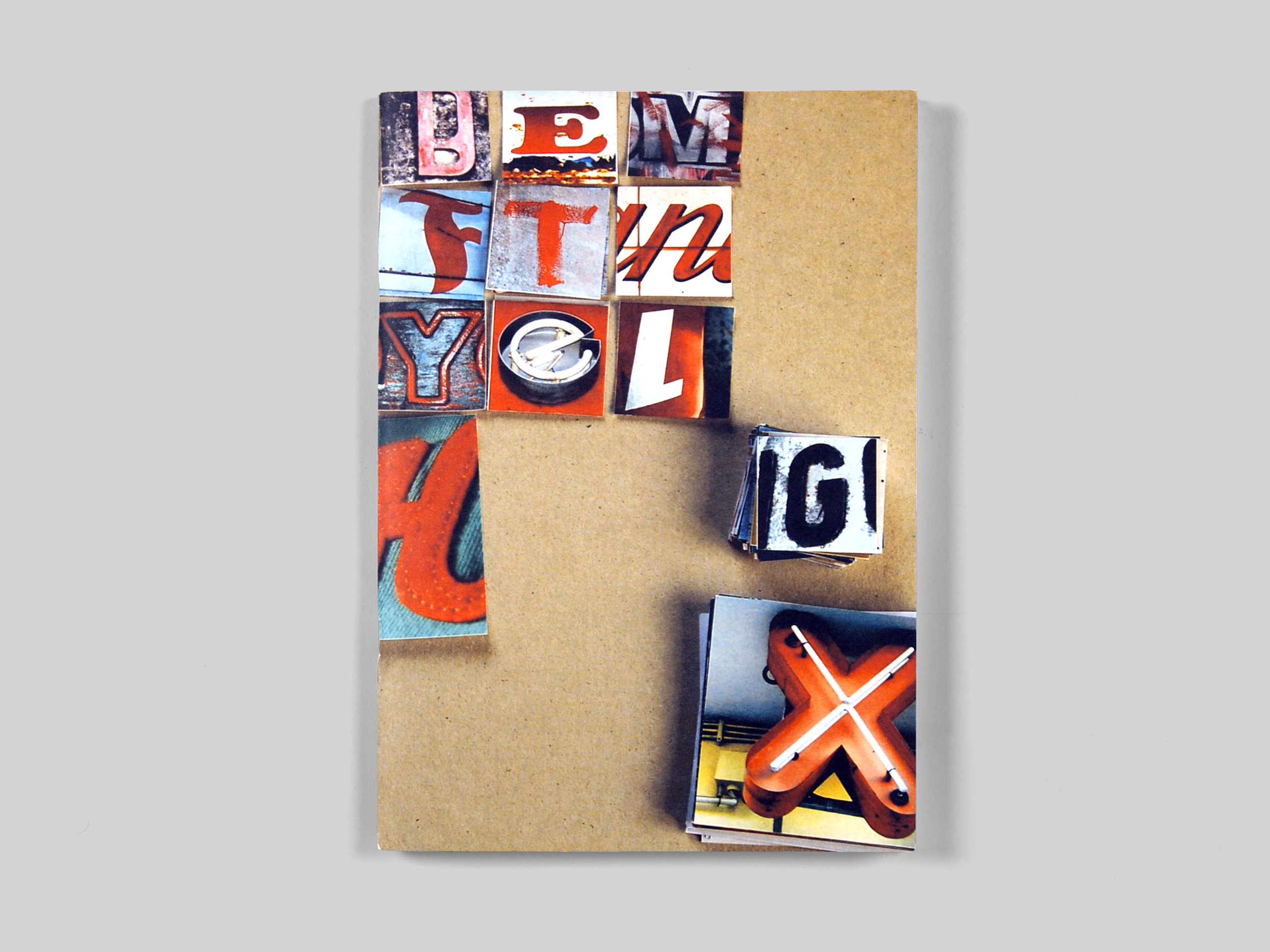
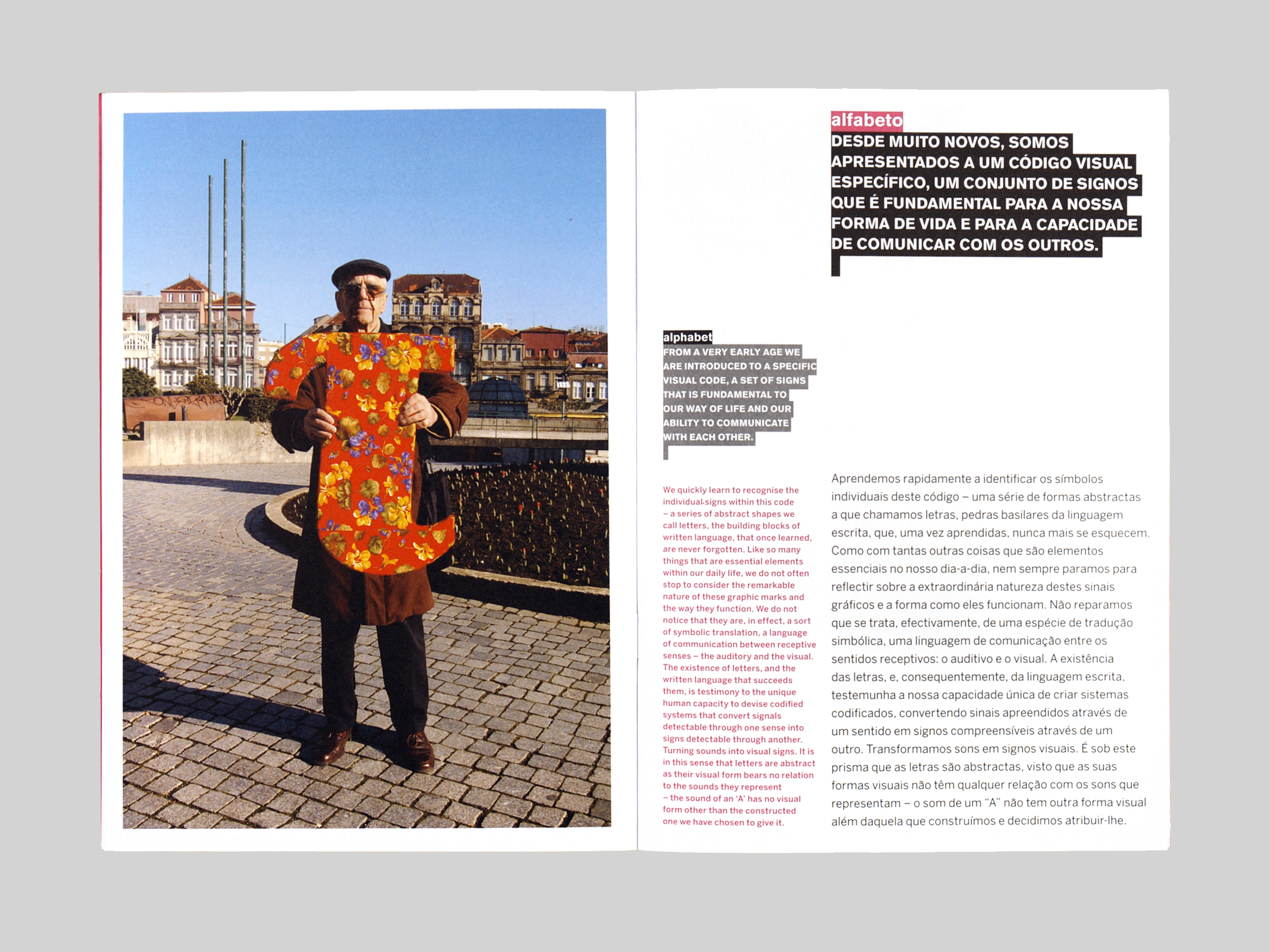
Idioms is a series of six exhibitions that explores the impact of graphic design in our everyday lives by looking more closely at the visual forms and graphic languages that surround us. Curated and designed by Andrew Howard, the series was part of a programme that the Serralves Foundation has developed with the Silo–Espaço Cultural, NorteShopping. 2006–2008. Each exhibition was accompanied by a publication (average 48 pages), A5 in format, except for the last exhibition Gateways, which was accompanied by a 444 page book, also A5 in format, awarded a certificate of Typographic Excellence from the New York Type Directors Club.
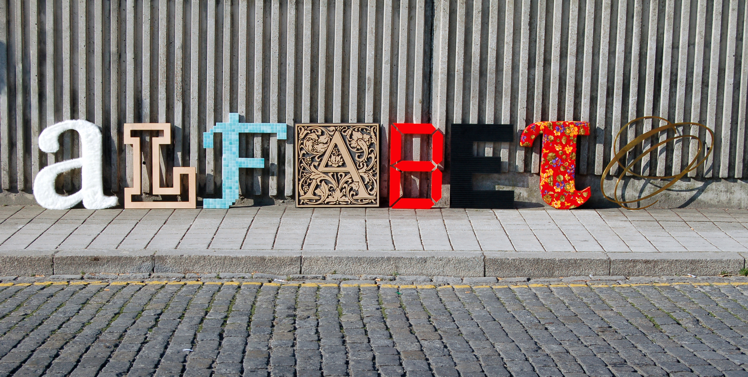
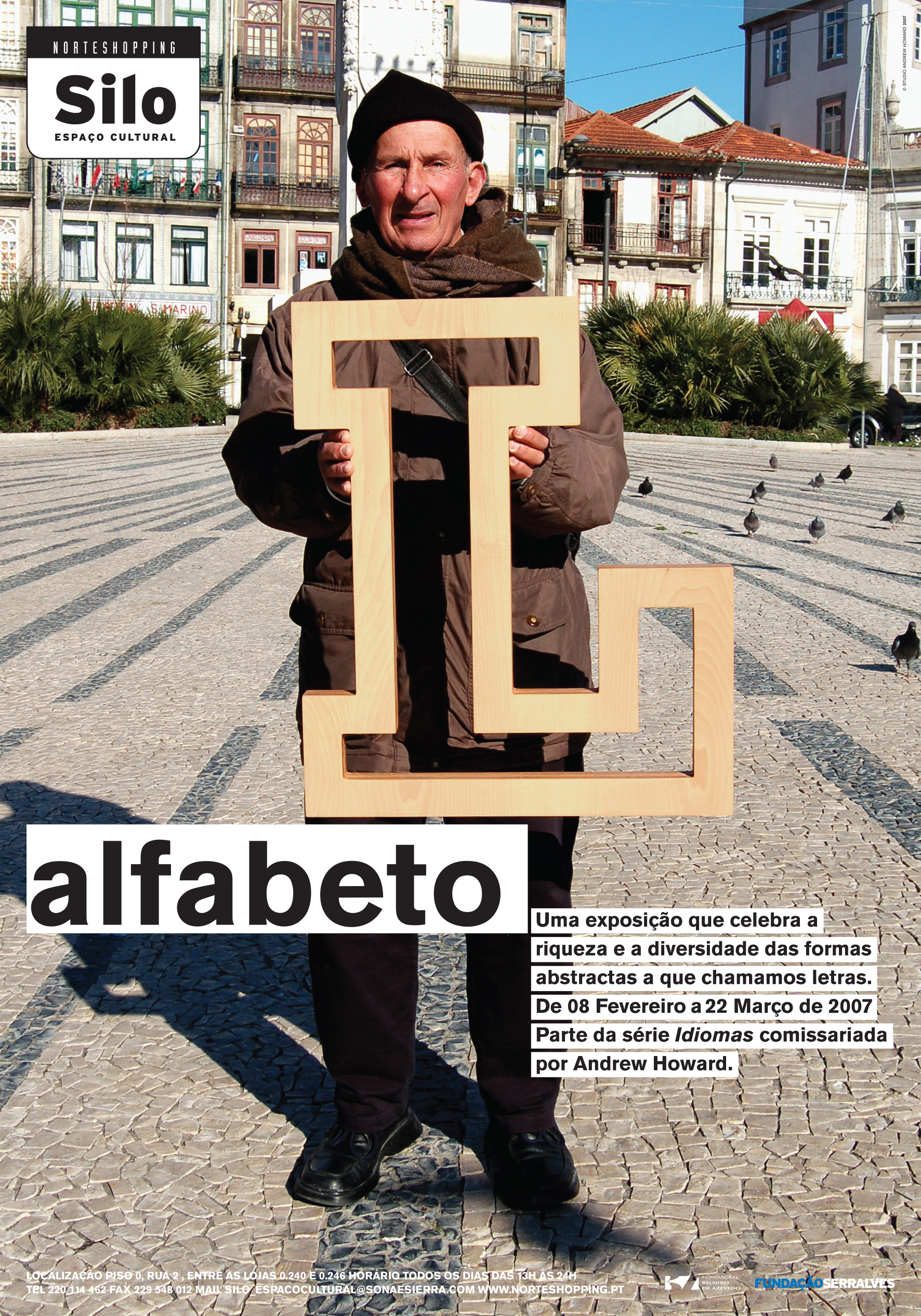
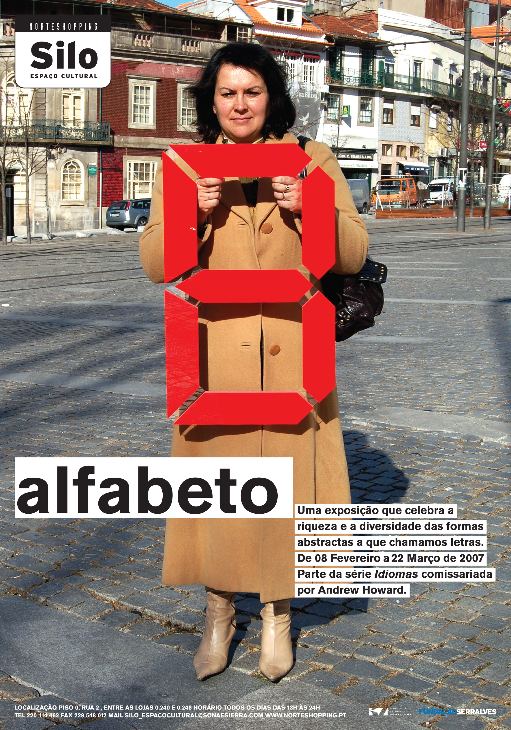
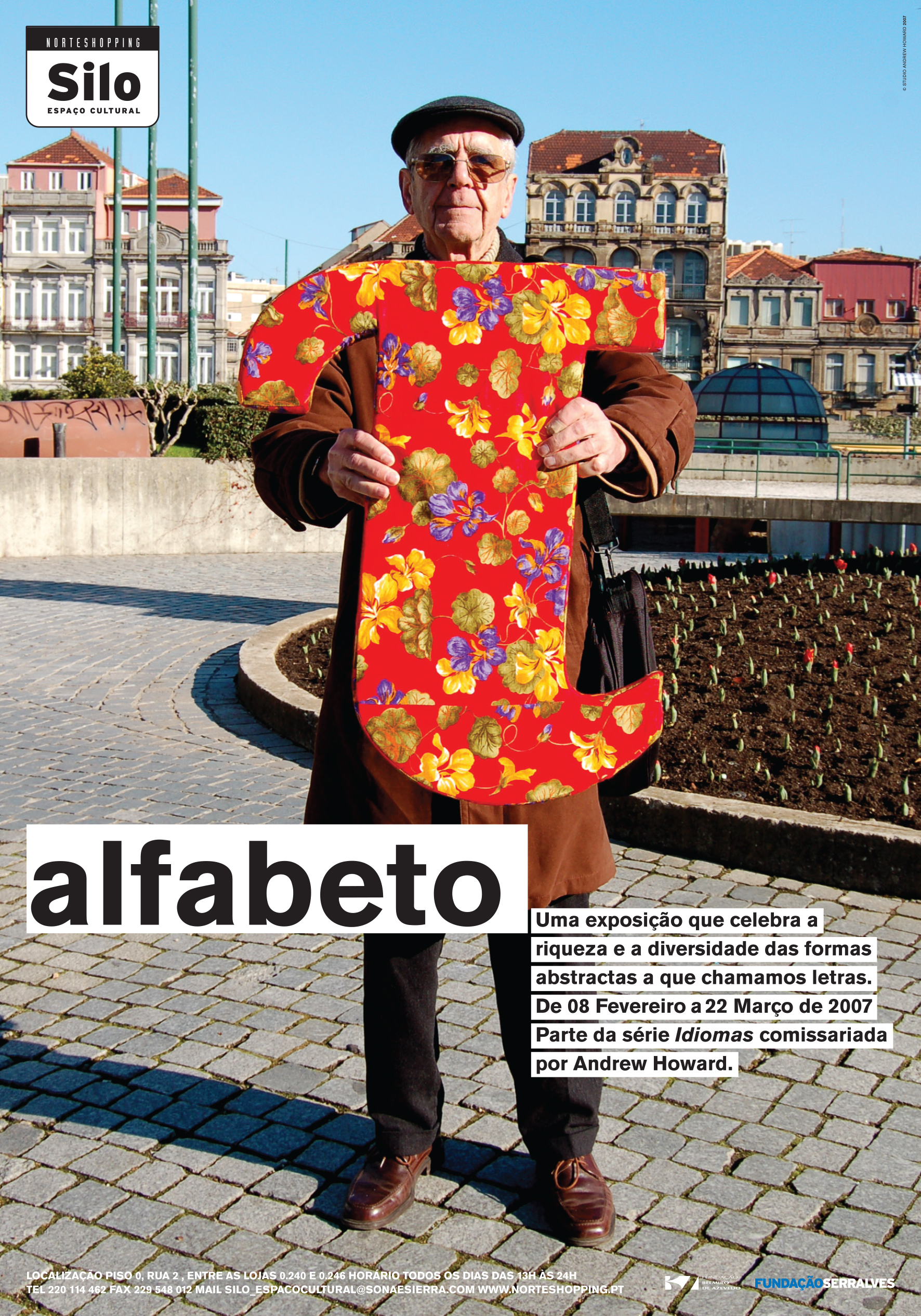
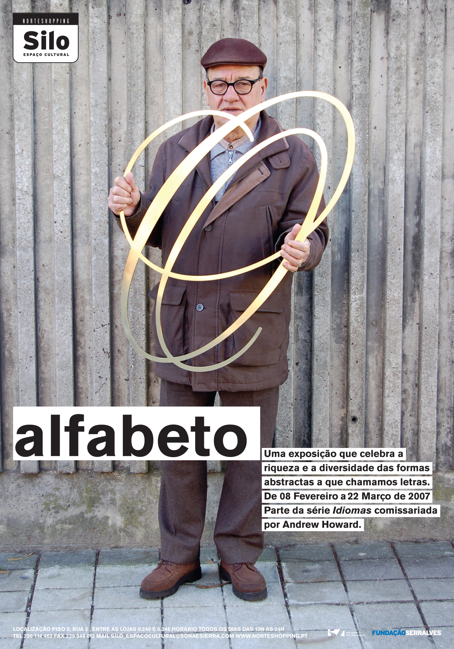
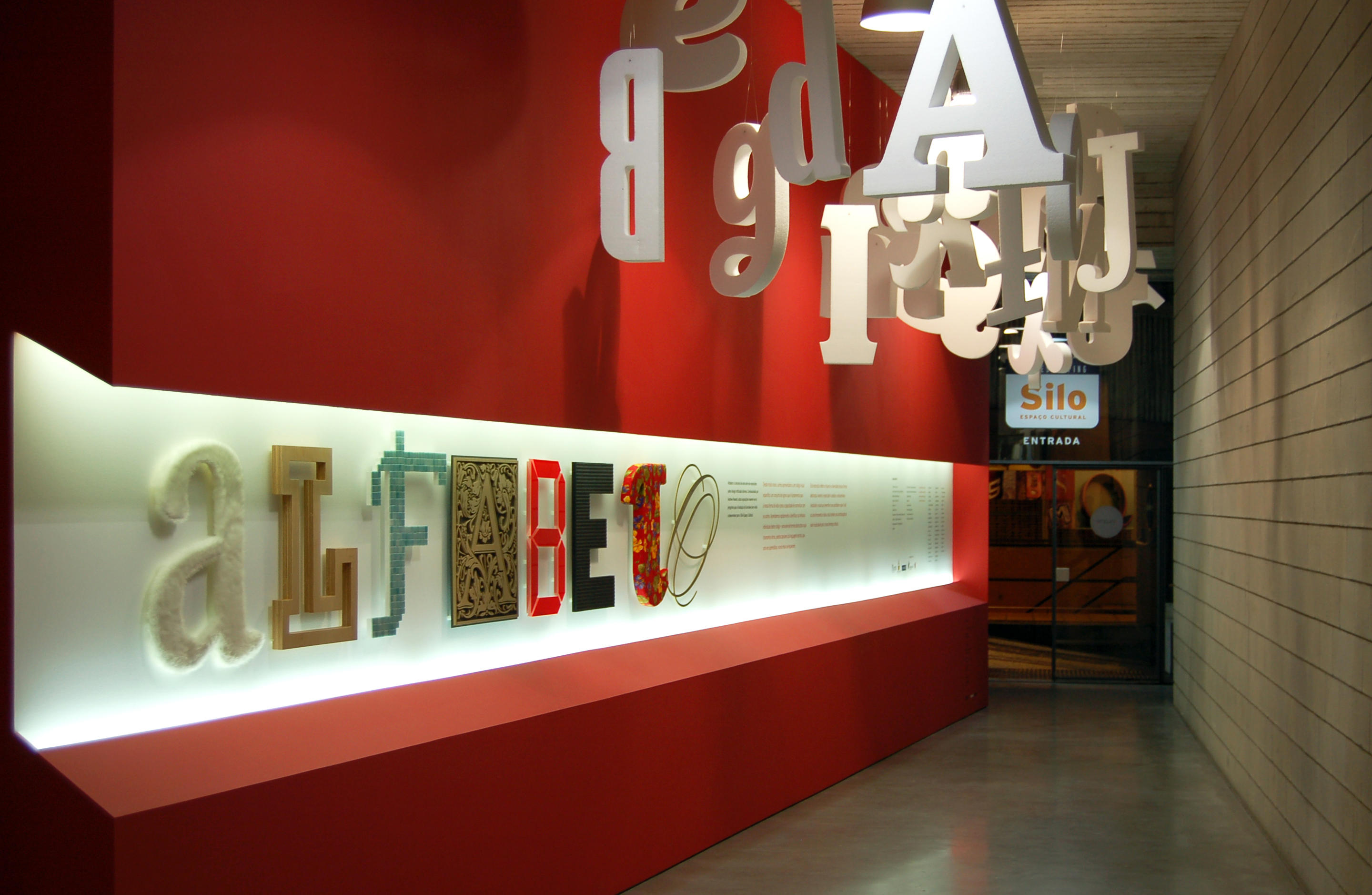
The 3rd exhibition, Alphabet / Alfabeto (February 2007) celebrates the graphic code we know as letters.
About the exhibition
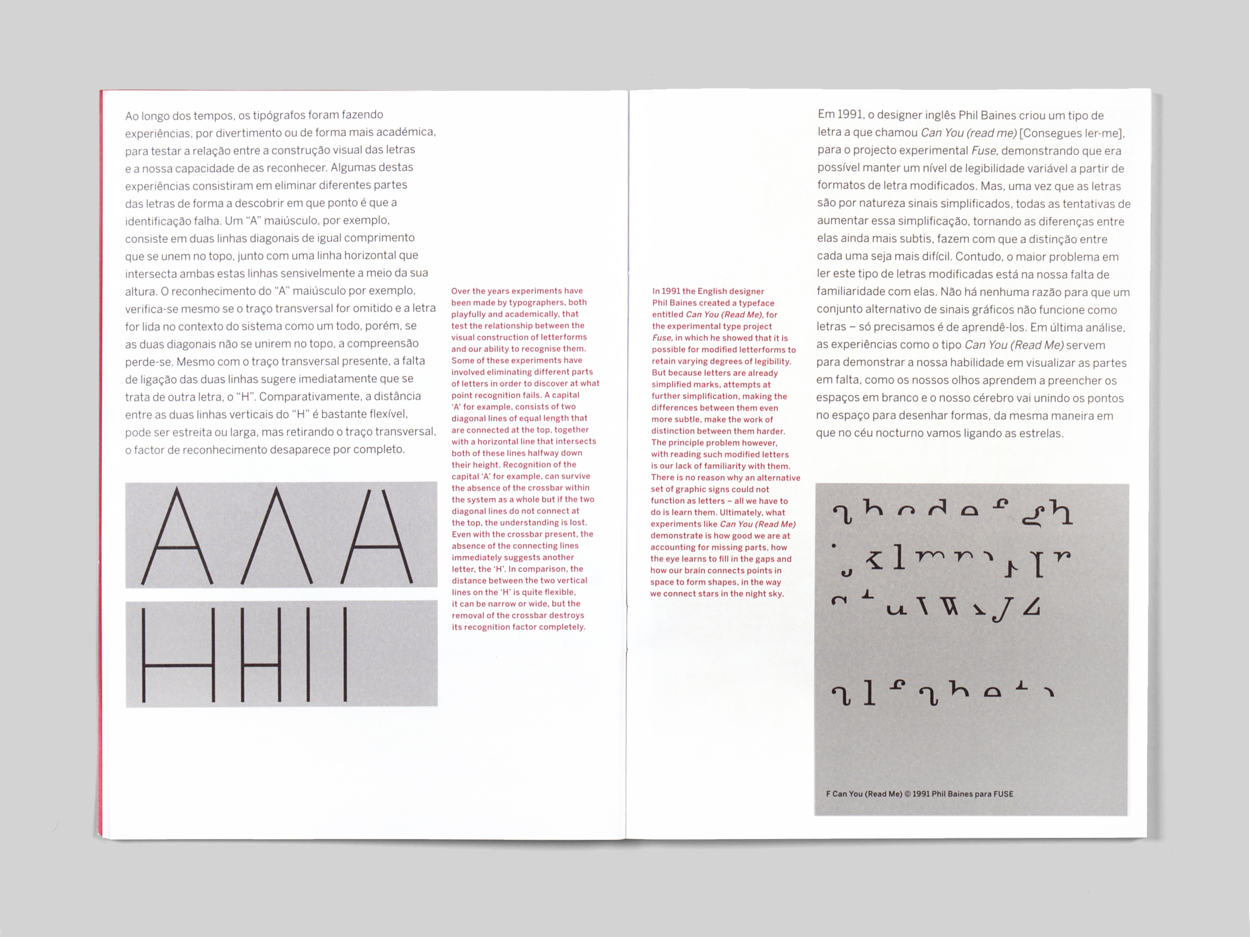
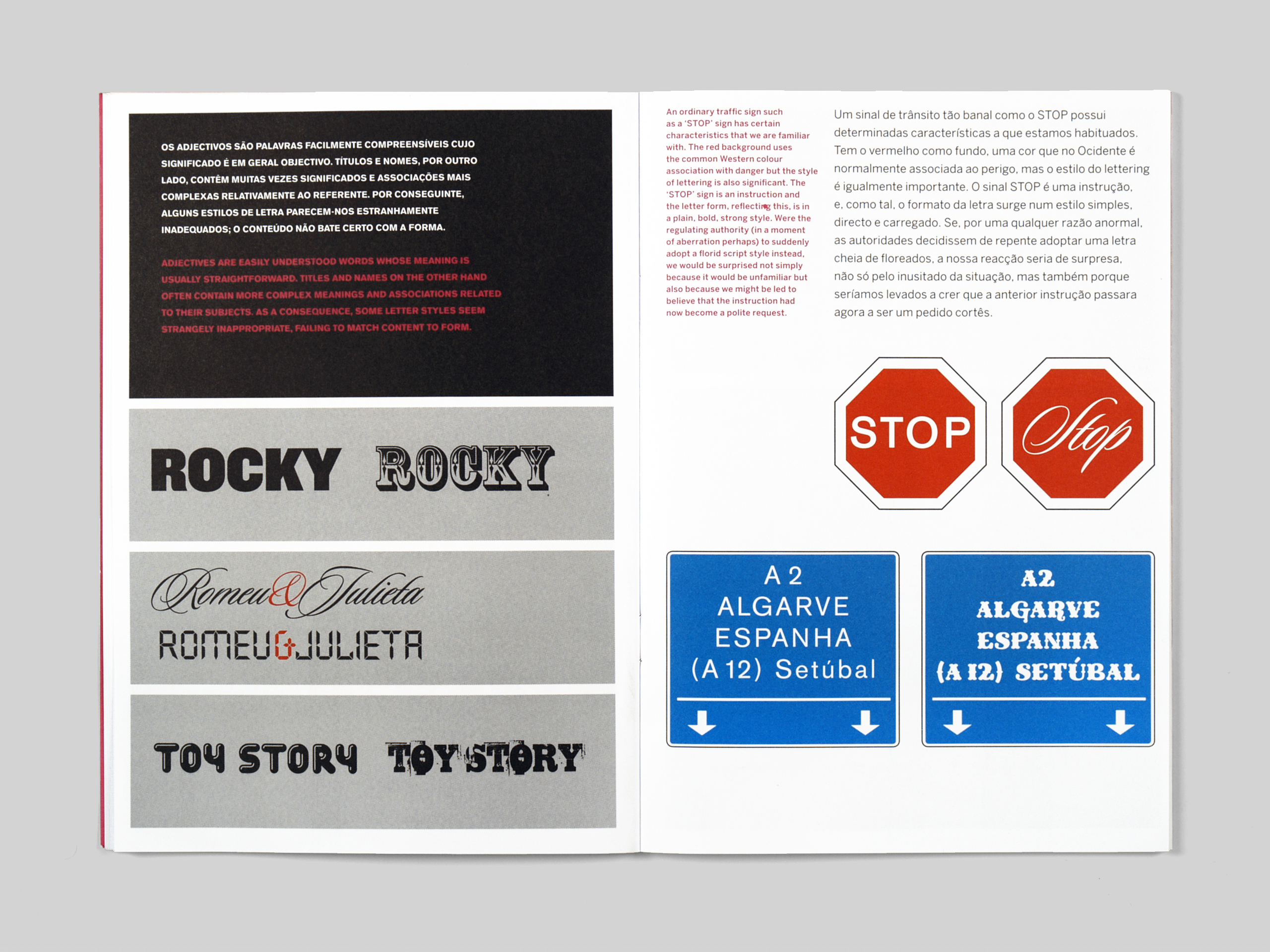
From a very early age we are introduced to a specific visual code, a set of signs that is fundamental to our way of life and our ability to communicate with each other. We quickly learn to recognise the individual signs within this code – a series of abstract shapes we call letters, the building blocks of written language, that once learned, are never forgotten.
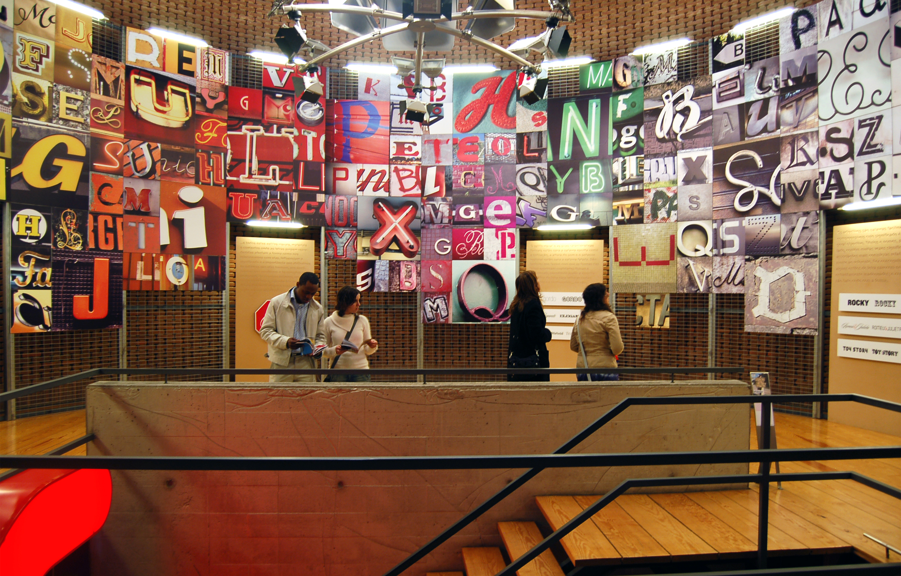
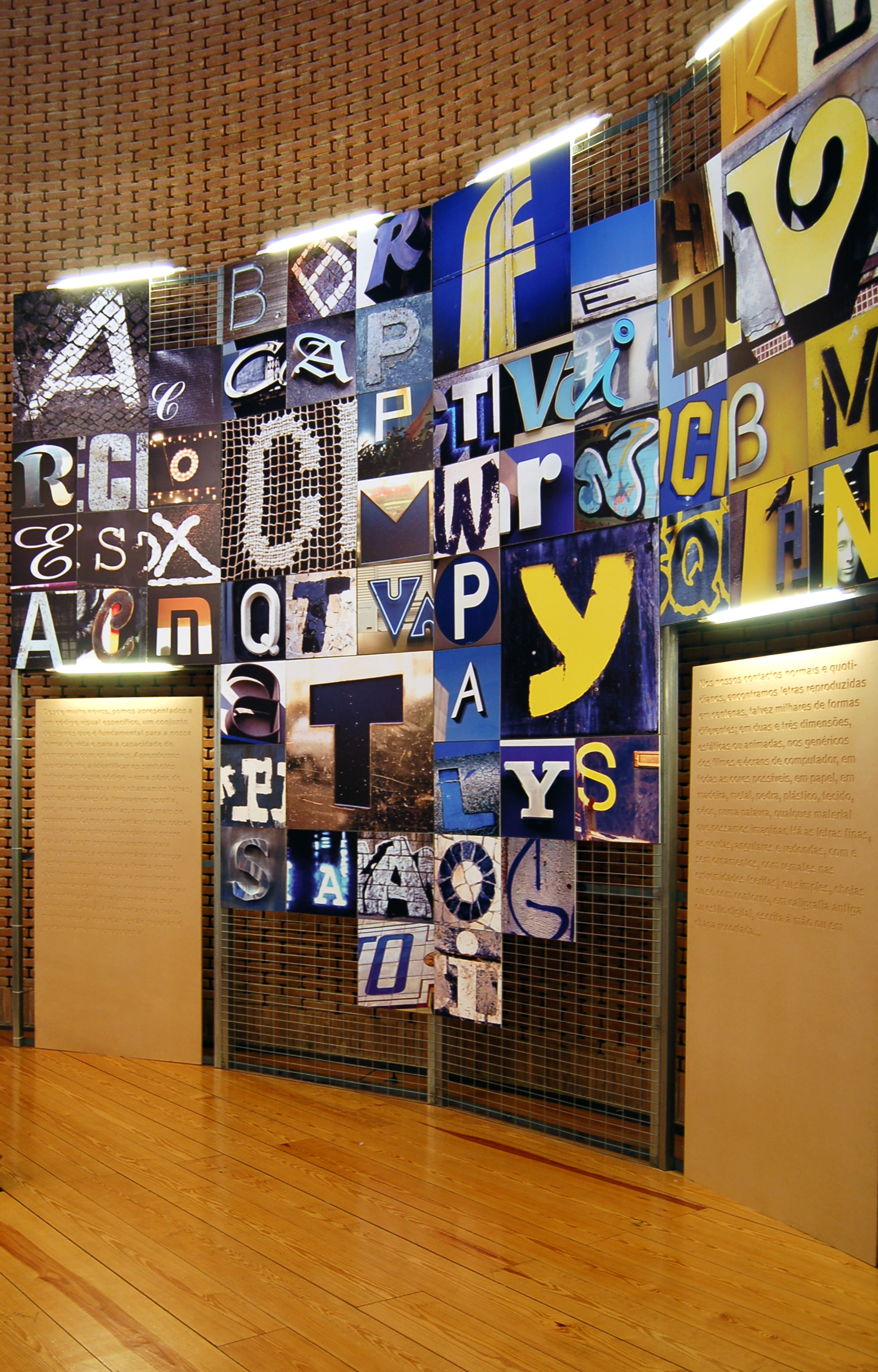
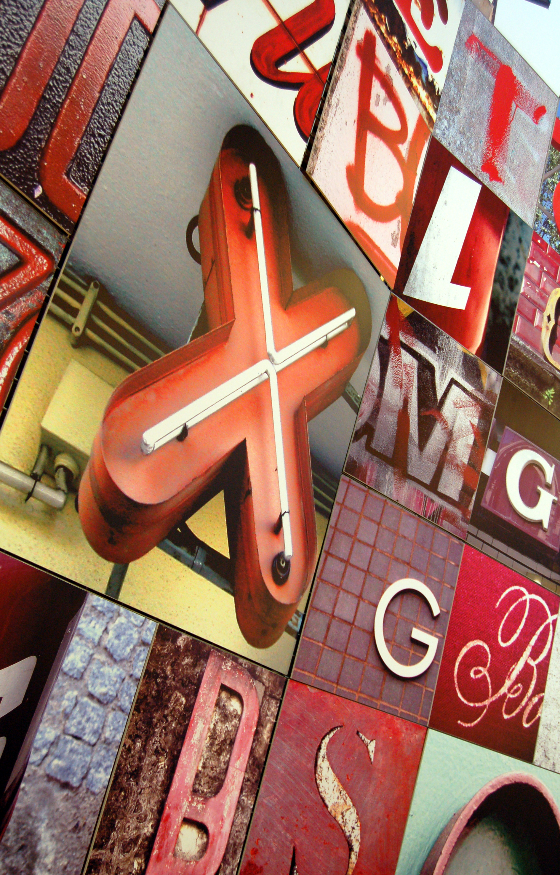
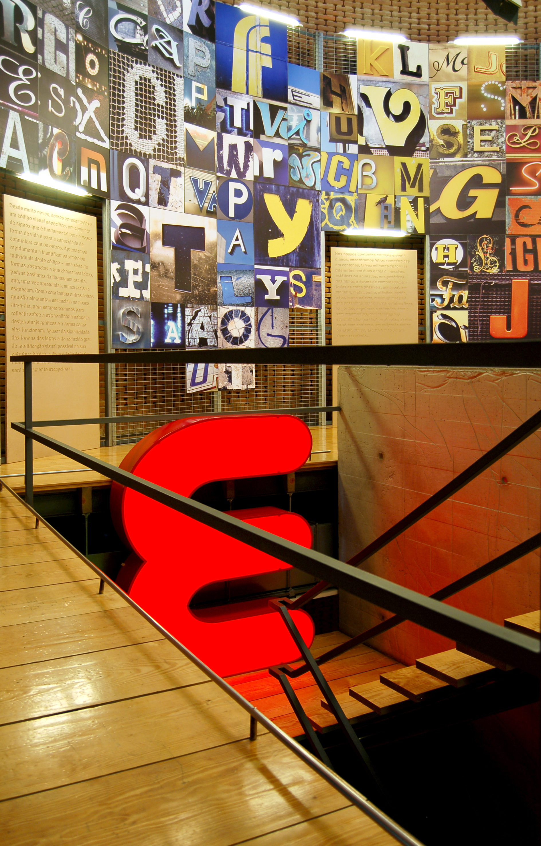
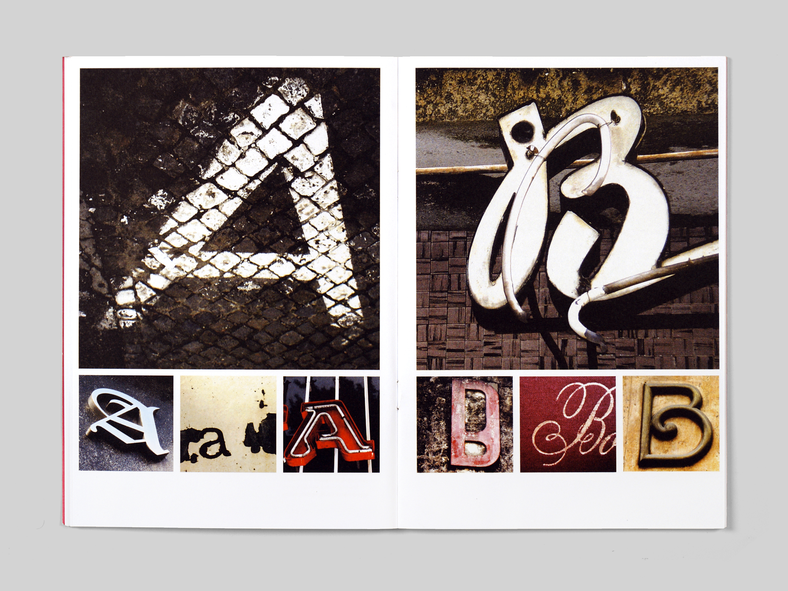
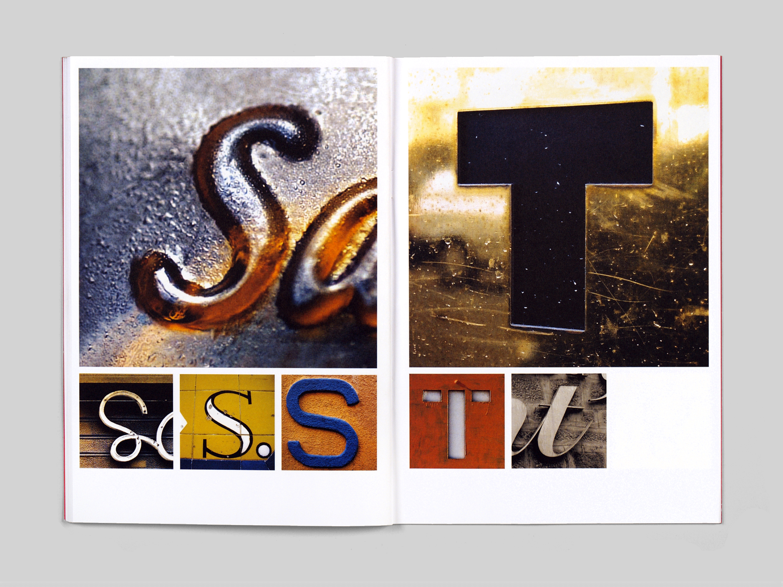
This exhibition is a celebration of wonderfully rich and diverse world of those abstract shapes. The photographs displayed on the panels are the work of communication design students at the Escola Superior de Artes e Design (ESAD) resulting from an Introduction to Typography project. The invitation made to the students, and that is made to the exhibition audience, is to look around and take stock of an extraordinary visual vocabulary in our daily lives which is both a creative tool and an invaluable contribution to our cultural heritage.




About the series
In 2005 I was invited by the then director of the Serralves Museum of Contemporary Art, João Fernandes, to curate a series of exhibitions in an unusual venue – the Silo-Espaço Cultural – a specially designed gallery space by renown Portuguese architect Eduardo Souto Moura, located in NorteShopping, a large shopping centre on the boundary between Porto and Matosinhos.
My choice of focus for the series was based on the thought that in our daily lives we are surrounded by multiple forms of visual communication. Everywhere we go we encounter the work of graphic designers; from corn flakes boxes, tax forms, newspapers and road signs to books, advertisements, company logos and web designs. All this graphic design work involves a search for visual forms through which to express messages, information and ideas. The result of that search will fashion the appearance of things but in doing so the work of the designer penetrates much deeper than the surface. Every choice of image, every selection of words, every graphic combination, every visual solution, becomes a way of saying something, a visual narrative that becomes part of our social dialogue, making the nature of what is expressed in public communication a concern for us all.
It is this visual narrative, its ingredients and the graphic environment it constructs that Idioms sets out to explore in closer detail by examining both what is communicated and the way it is communicated; how visual forms and languages are created and used. In addition, whilst encouraging critical reflection, Idioms is also concerned to celebrate the richness of this visual world, and by placing that which is familiar to us in a different context, aims to refresh the vision of the visitor to the exhibition and to renew their perceptions.
Cathedrals of consumption
The location for the exhibitions is unusual – the Silo-Espaço Cultural is a gallery space in a large shopping centre. This in itself creates a particular challenge – that of interrupting and diverting, if only momentarily, the normal routines of shopping, eating and going to the cinema. Added to this is that despite the thriving and growing design community in Porto, indeed in Portugal, there are virtually no designated design venues in the country, and exhibitions that focus on graphic design are few and far between. With this mixed context in mind the Idioms series attempts to accommodate two different types of audience: on the one hand some of the thousands of visitors that the centre attracts every day, many of whom are unlikely to visit museums and galleries of art with any frequency, if at all, and on the other, a specialised audience of designers and students whose interest and enthusiasm is already active.
Whilst the primary function and purpose of the centre is shopping, it is not exclusively so. Such centres have become places for people to gather, to be where others are, to window-shop and generally pass the time of day. The environment in which this is done is a wall-to-wall, floor-to-ceiling mosaic of visual information and decoration. In the modern shopping centre there is no place or space which is not filled with colour and texture and signage. We experience a veritable cathedral of graphic intervention.
It is precisely the nature of this context that guided the nature of the series. And although the themes of the exhibitions are not directed at what we find solely in shopping centres, the omnipresence of graphic design in such places provides the perfect setting to explore some of the many aspects of the manufactured visual culture that frames our day-to-day lives, and enables us to take a ‘behind the scenes’ view of the designer’s skills, tools and methods.