Porto Design Biennale
Graphic Identity (Institutional)
Certificate of Excellence, International Typographic Awards 2024, ISTD
In January 2023 I was invited to design the general graphic identity for the Porto Design Biennale, and also the specific identity for the 2023 edition (3rd edition). In turn I invited fellow designer colleague and educator André Cruz to join me.
Designing the general identity of the Porto Design Biennale
Andrew Howard & André Cruz
Most commonly, the objective of a graphic identity is twofold: to give visual form to the name of an entity or event (by designing a logo or masthead), and to create a visual language which becomes the way in through which the entity or event addresses its audience. Both of these objectives have the same aim – to produce distinctive and therefore recognisable communication.
There are two graphic identities involved in this project for the Porto Design Biennale. One is the general identity – the perpetual institutional voice, operating regardless of the particular theme of each edition. The other is the graphic identity of the specific edition – in this case the one for 2023 – which aims to express its unique theme. Here we address the general identity. The edition identity, whose 2023 theme is ‘Ser Água / Being Water’, is a work in progress.

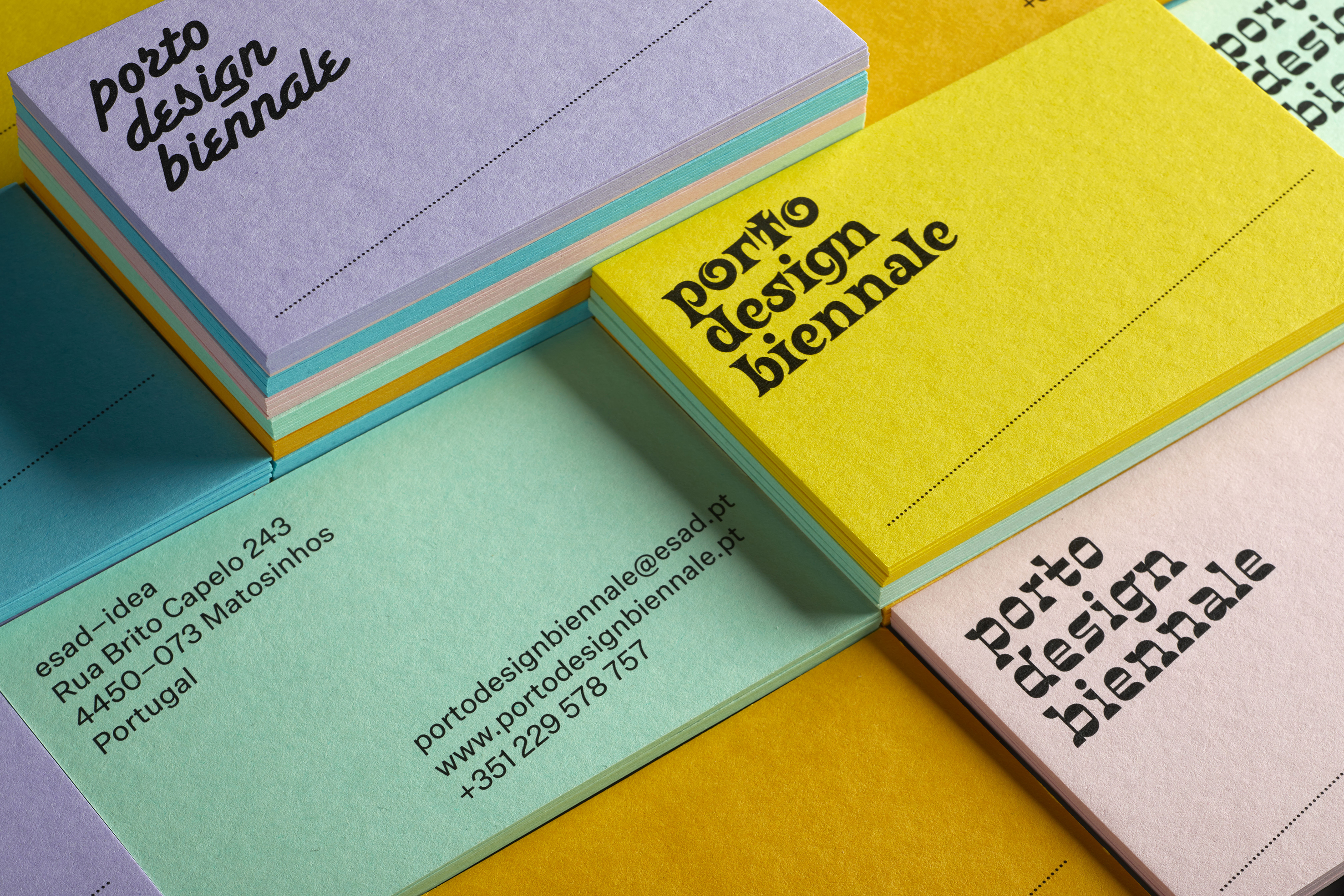
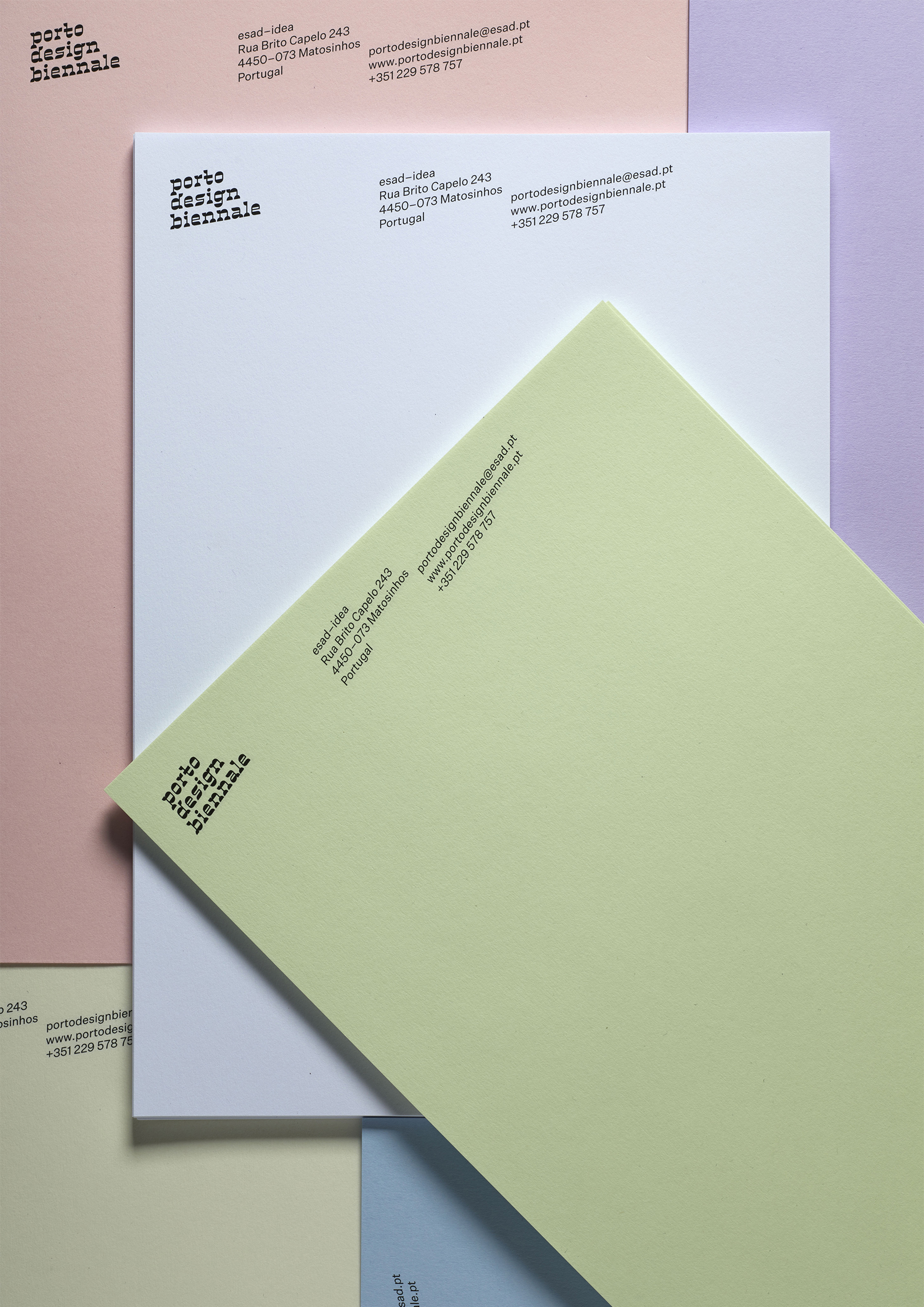
To begin, we were given a parameter – not to use the acronym PDB. Instead, we were asked to spell out the three words. So we examined the letter composition. The three words together contain nineteen letters. Thirteen of them are different, four of them are repeated.
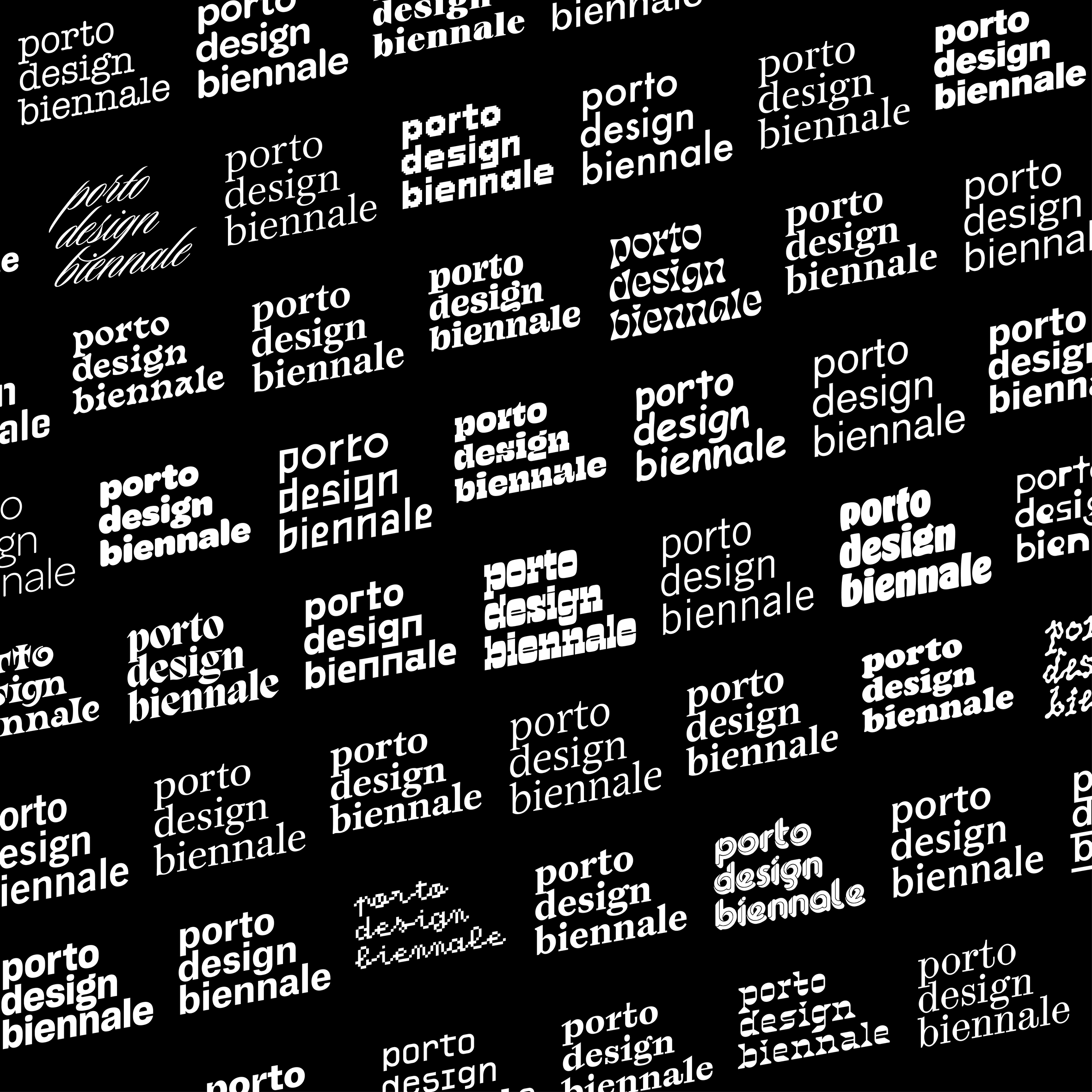
We concluded that the variety of glyphs contained in the three words was insufficient for a typeface to really show itself, and thus become visually distinctive as a logo. Besides, we couldn’t find any interesting criteria with which to choose one typeface over another. Nor, although we considered it, could we justify designing a bespoke one. So we created our own parameter: avoiding a solution that depended on choosing a specific typeface.
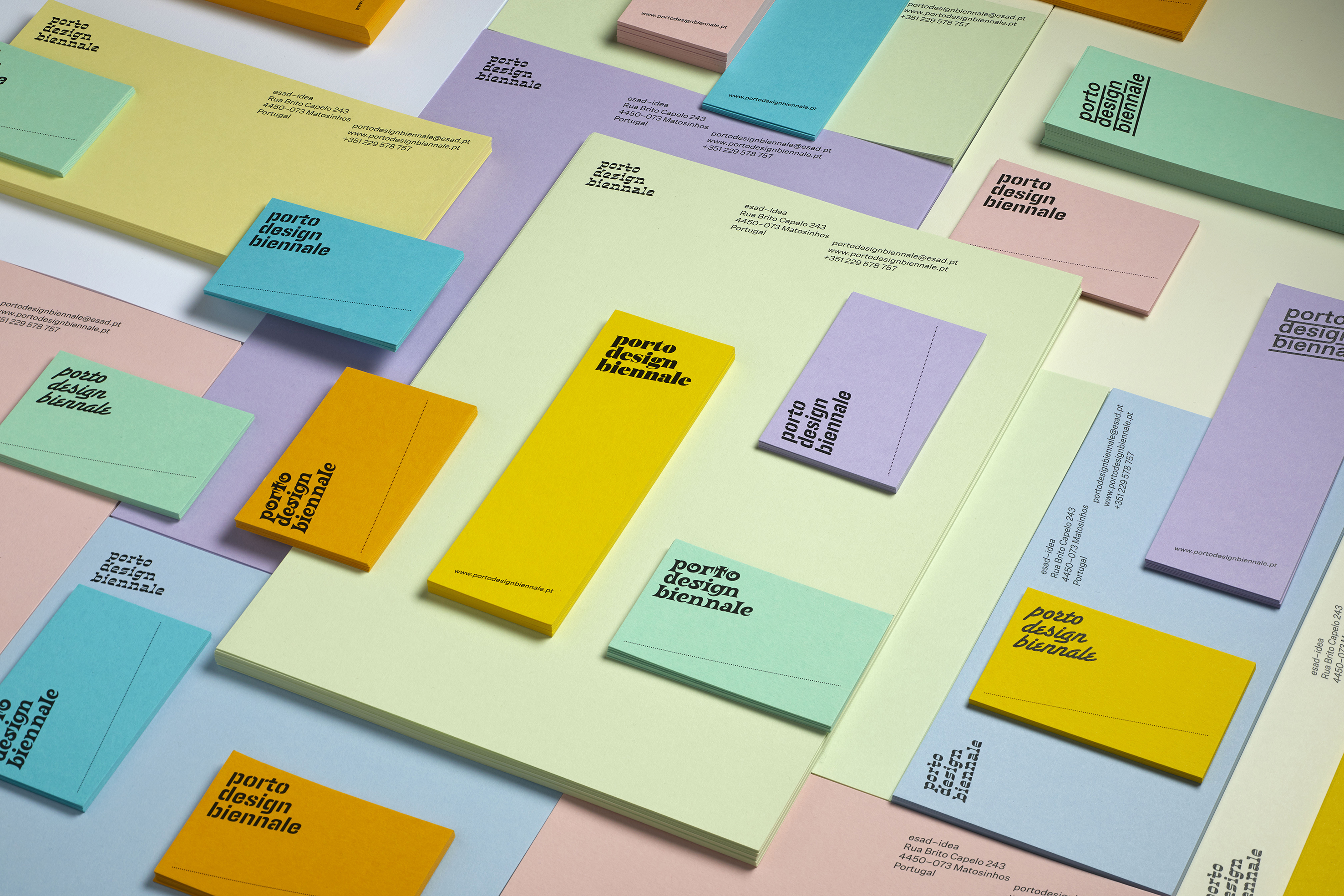
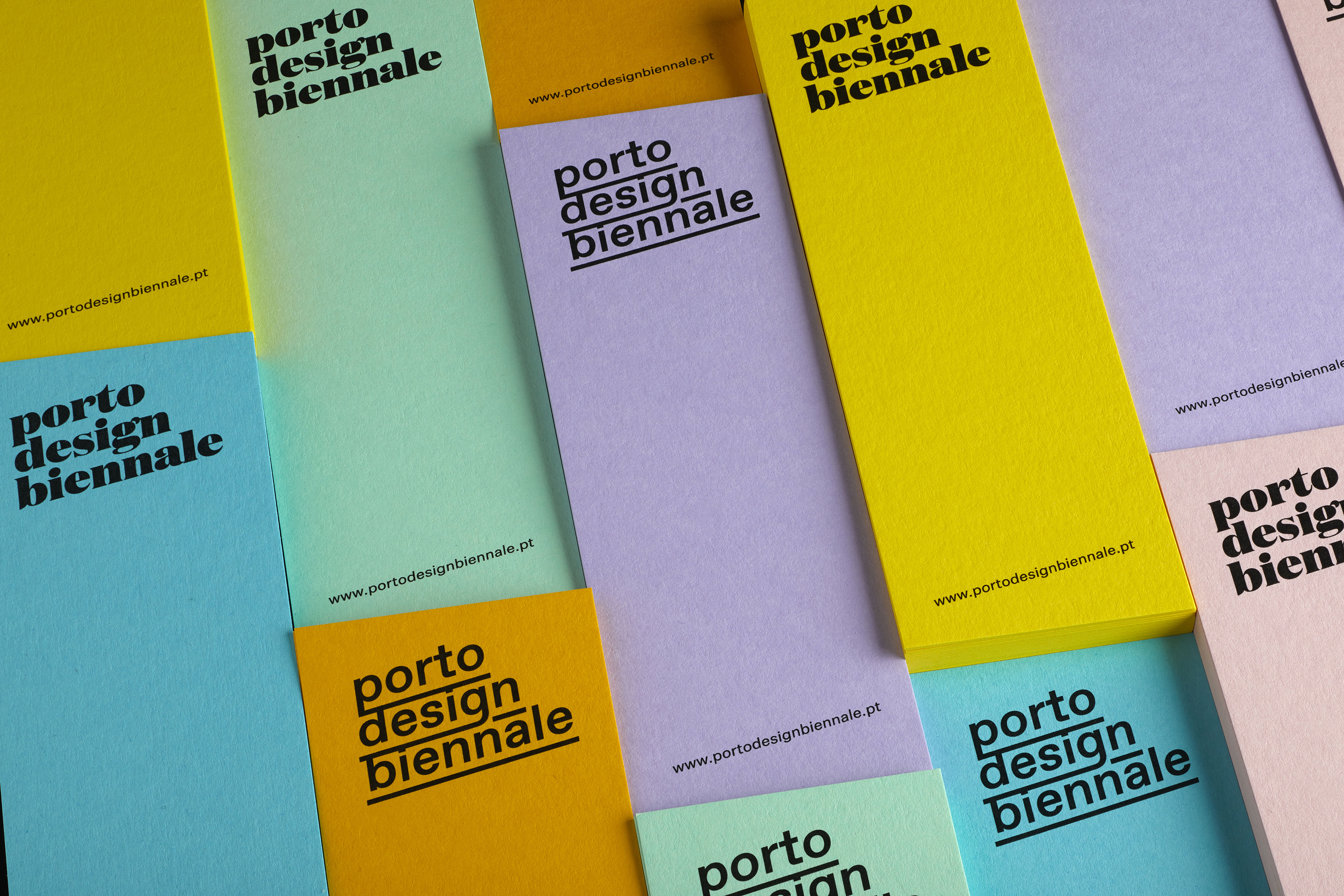
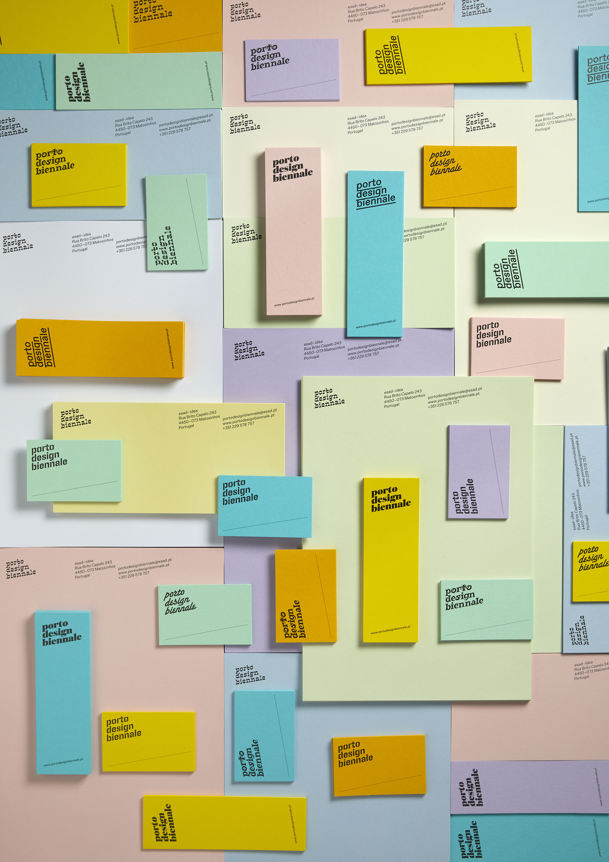
Instead we began to explore the possibilities of a treatment – which we are calling a ‘recipe’ – that we could apply to any typeface. In a very handy manner, this approach suited and enhanced our design thinking because it sidestepped the self-imposed dilemma of typeface choice, and in so doing, replaced it with a plurality of choice. The result is a solution in which there are no right or wrong choices, there are simply alternatives, instead of uniformity there is variation and difference.
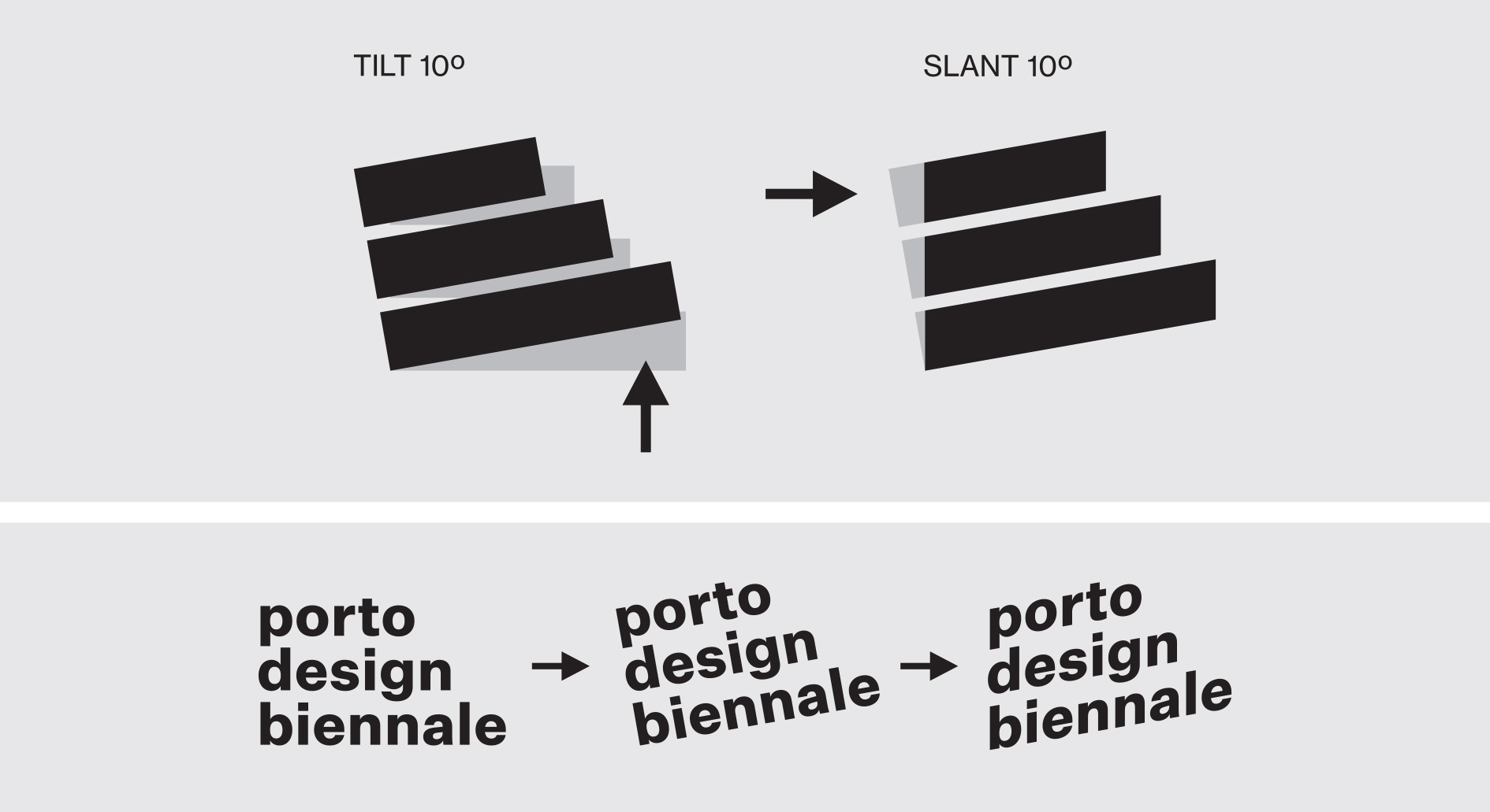
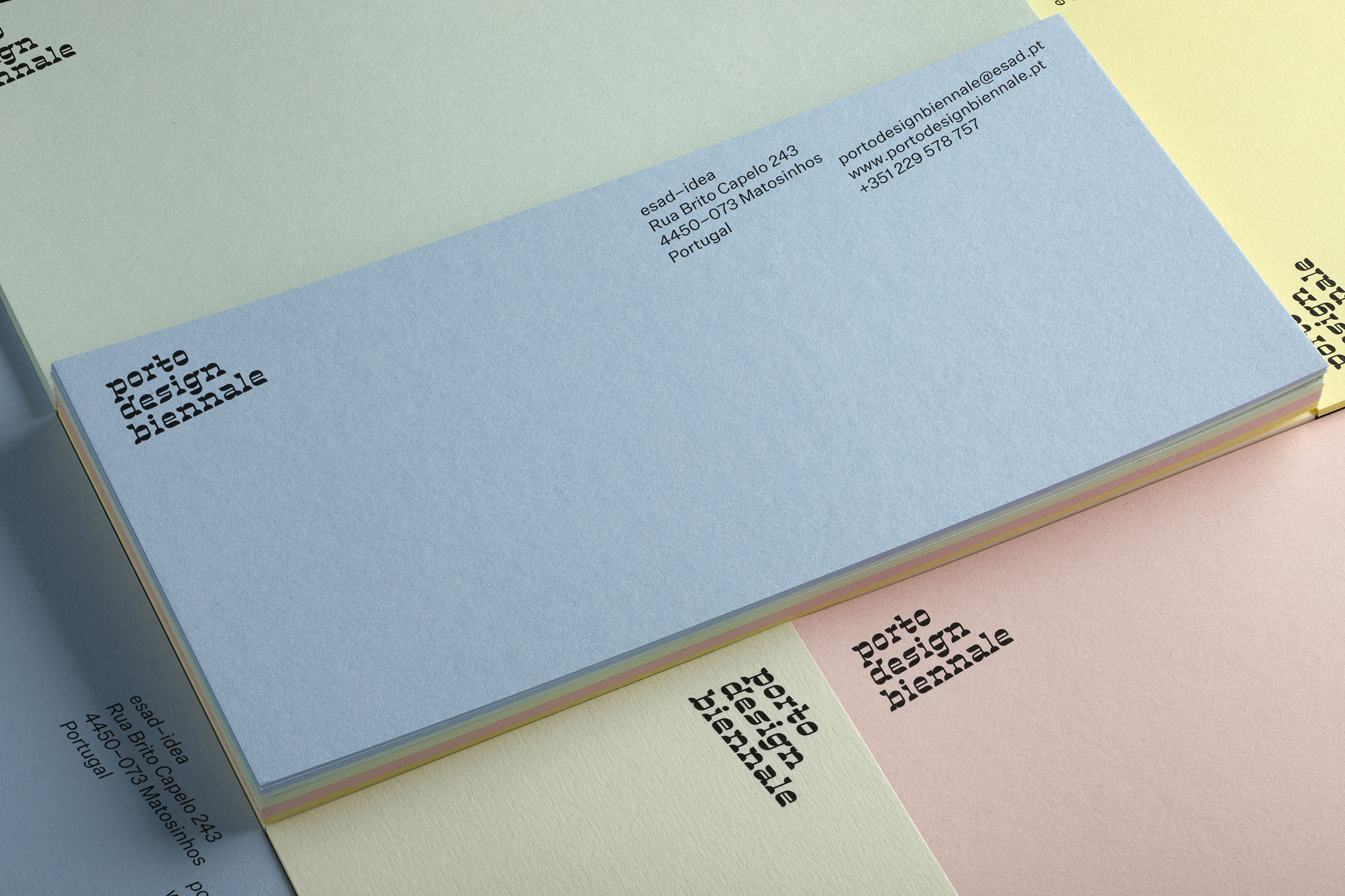
The recipe however isn’t solely about the wide range of type selection, it’s also about what to do with it. Conventionally type functions on horizontal and vertical axes – vertical strokes and horizontal cross pieces. It also sits in horizontal formation. The recipe we devised involves changing the angle of the type, by applying a ‘tilt’ and a ‘slant’. We all know that human vision is particularly good at noticing difference, and changing the angle of the type is a simple way of disrupting expected reading. This disruption we believe, is enough to be visually distinctive.
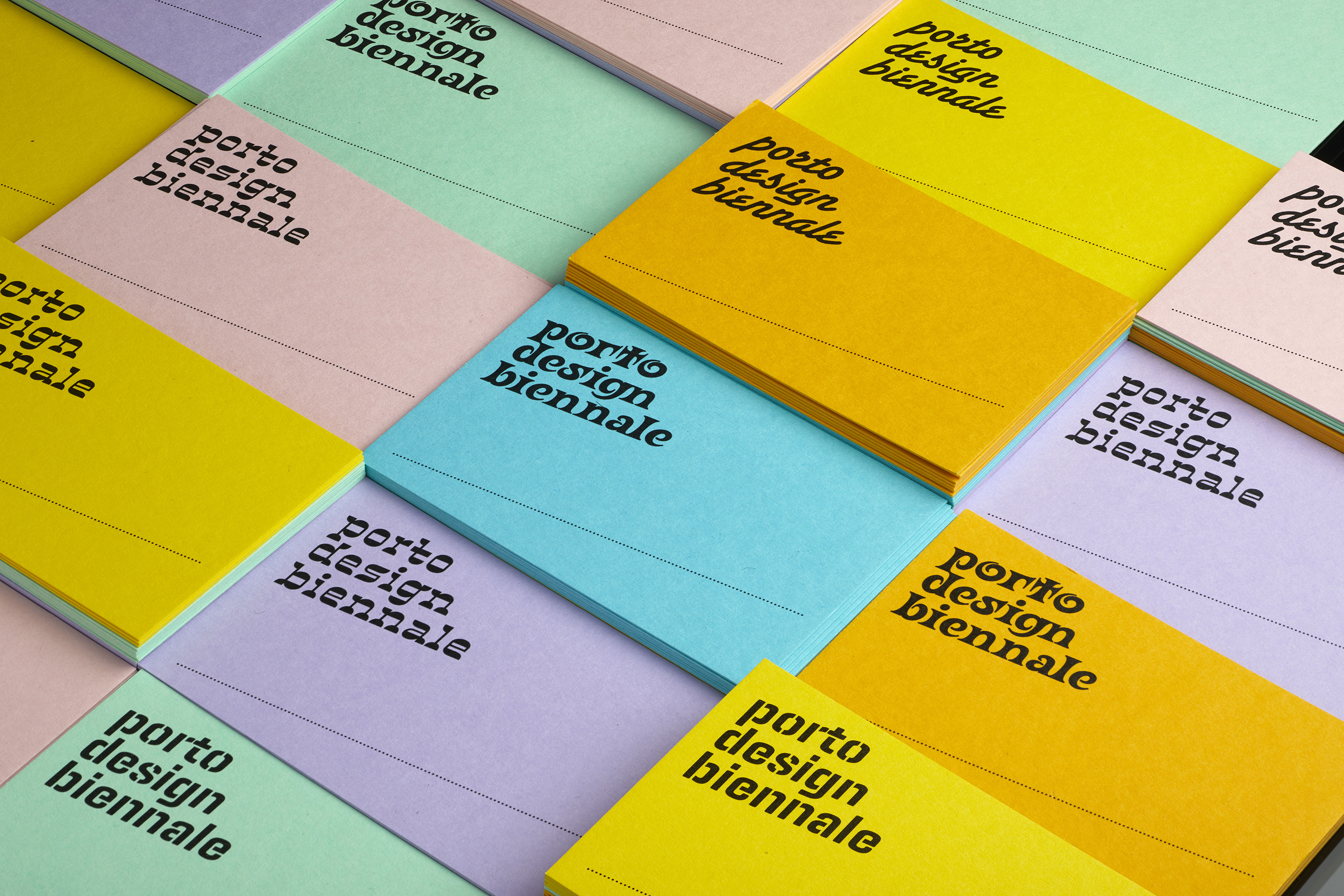
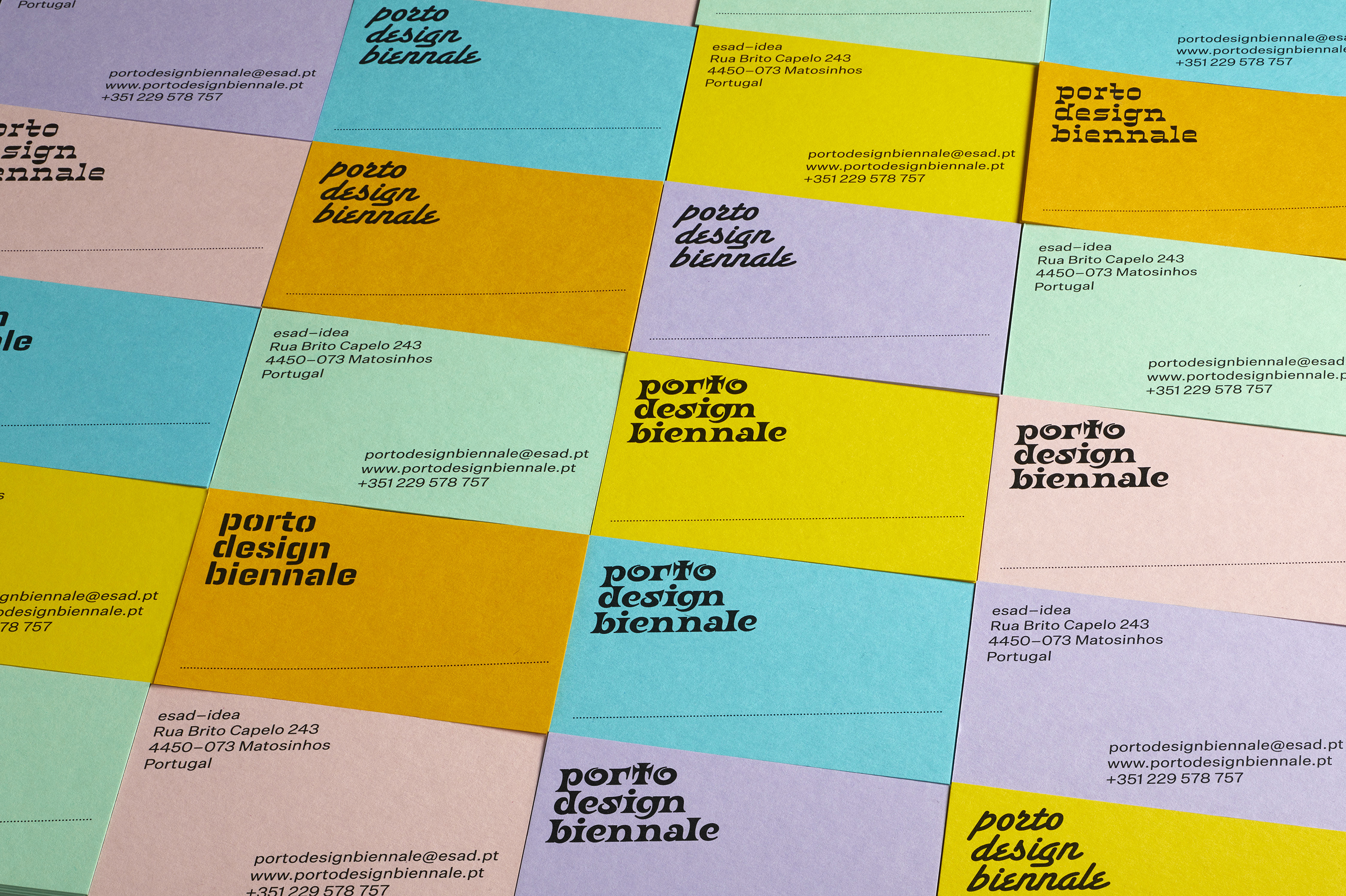
The complete recipe is to tilt the type by 10 degrees and to then slant it by 10 degrees. This way the type, although being at an angle, still sits vertically. To support the identity we created a palette of typefaces, including as many free or inexpensive ones as possible. This palette is not (ever) complete, being open to continual expansion.
One more fundamental element completes the parameters of the identity. Colour. Wherever possible, not printed colour, but the colour of the paper (or material subject to printing). We opted for a selection of colours from the Colorplan range by G.F Smith.

Sound & image. We also created a series of playful animations for social media in which sound played a very important part, the first of which appears at the top of this page.