Siza: 90 Anos/Years
Editorial (Architecture)
An editorial project celebrating the ninety years of renown Portuguese architect Álvaro Siza. The series consists of ten large format bilingual publications (Portuguese and English) authored by close friends and colleagues, each recounting and recording memories and insights in celebration and in tribute to him. Edited by the architect António Choupina, organised by 100Folhas and supported by the Público newspaper, the series was distributed with the newspaper over a period of ten weeks beginning in September 2023. The collection is archived in a box, available with the first issue.
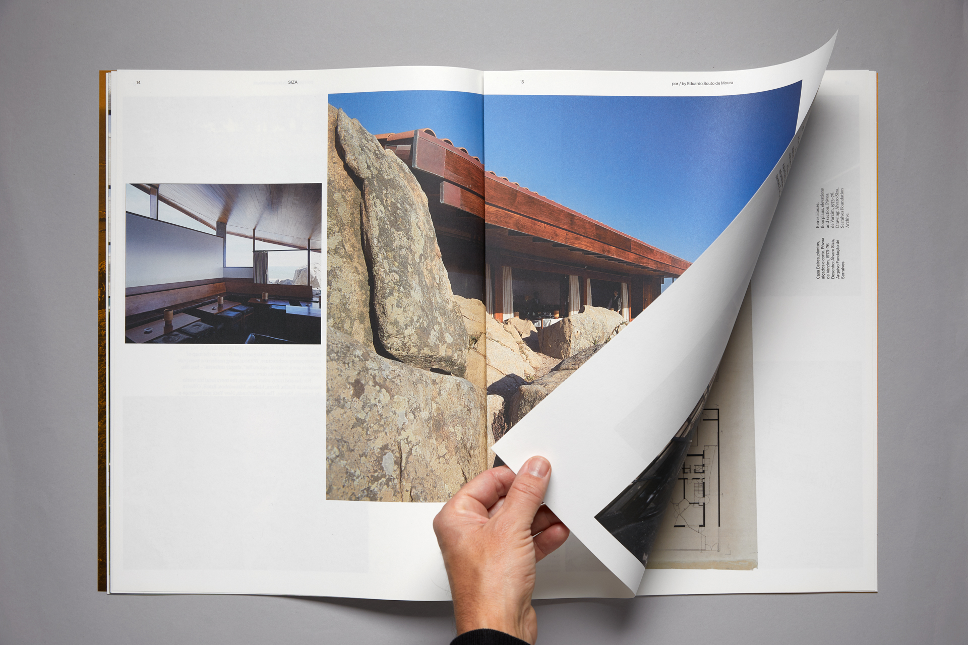
We began thinking about the project by exploring the design parameters – what we describe as trying to locate the edges of a project. In this case it meant considering both small and large formats, their merits and restrictions. Small book formats circumscribe design possibilities by restricting the amount of content that pages can hold. This can be a very interesting constraint. It means the editorial design process – the decision-making process – becomes predominantly concerned with narrative structure, pace, rhythm and above all sequence. We also considered that in terms of engagement, smaller publications have the capacity convey a greater sense of intimacy, if that is what is desired.
Alternatively, a large format allows more items to be placed on the page — differing sorts of texts and images — and consequently design decisions become predominantly concerned instead with compositional structure. Furthermore, at least two formal characteristics come into play that are much less prominent in a small formats: space and scale. Considering, the significance of the project and the architectural characteristics of space and scale, we opted for the large format.
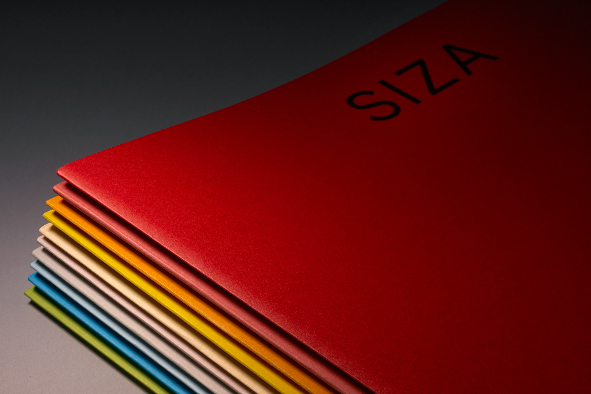
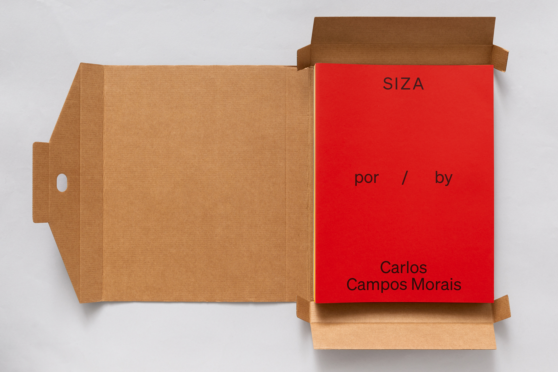
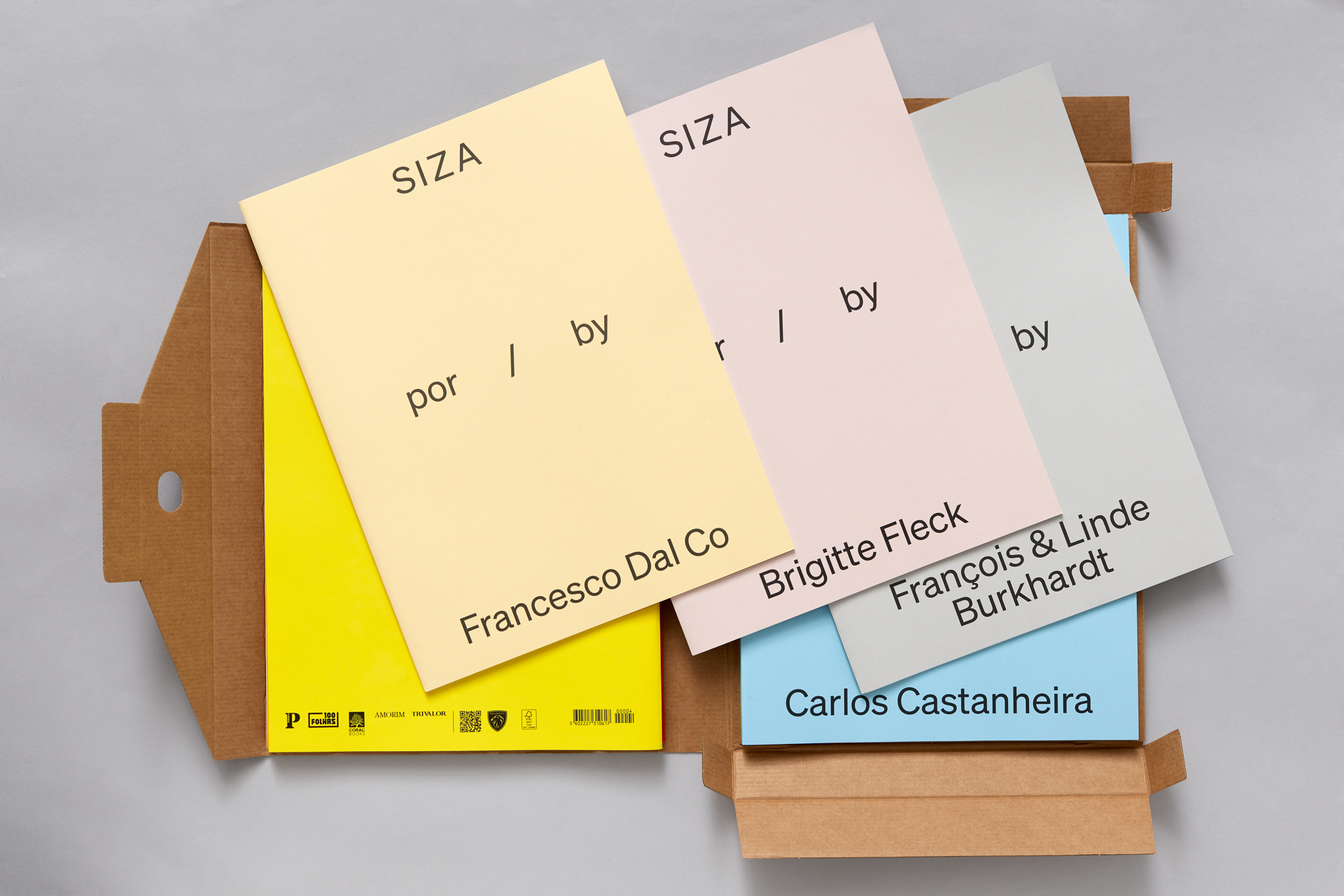
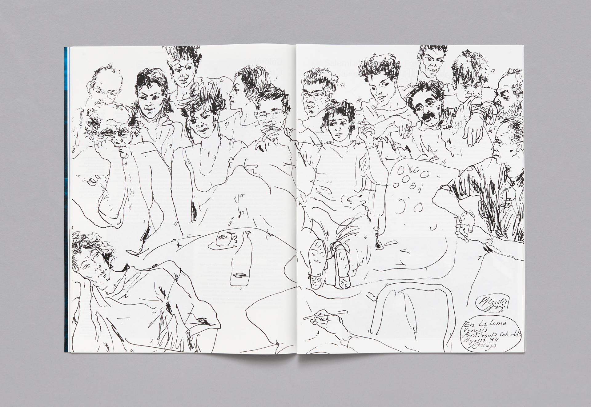
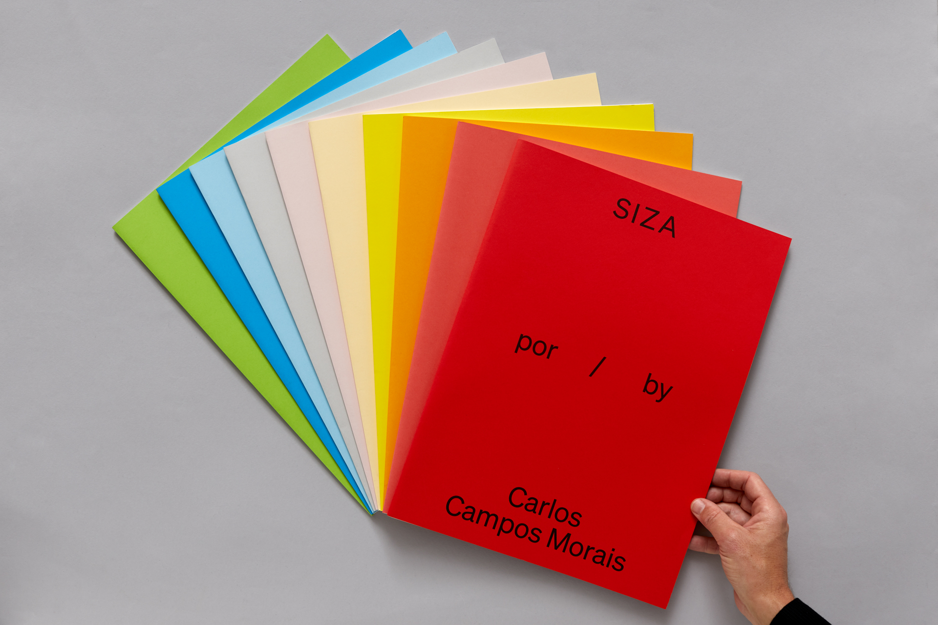
Regarding the covers, we choose to avoid the use of imagery because of the interpretative significance that a specific image may have for ensuing issue. Instead we opted for type only covers, initially with only a change of the authors name at the bottom. Wondering whether such a change would be enough of a distinction between issues, we added another layer of code — colour. Not printed colour, but material colour. Naturally, the range of paper colours available is hugely restricted in comparison to the Pantone range. The added dilemma was not only the very idea of colour for a project about Siza, but what palatte of colour. Our choice was greatly circumscribed by colour ranges available but we nevertheless chose (for Siza) a less expected spectrum.
Designers: Andrew Howard, Miguel Howard. Project photos: Filipe Braga.