O Ser Urbano_1
Editorial (Architecture)
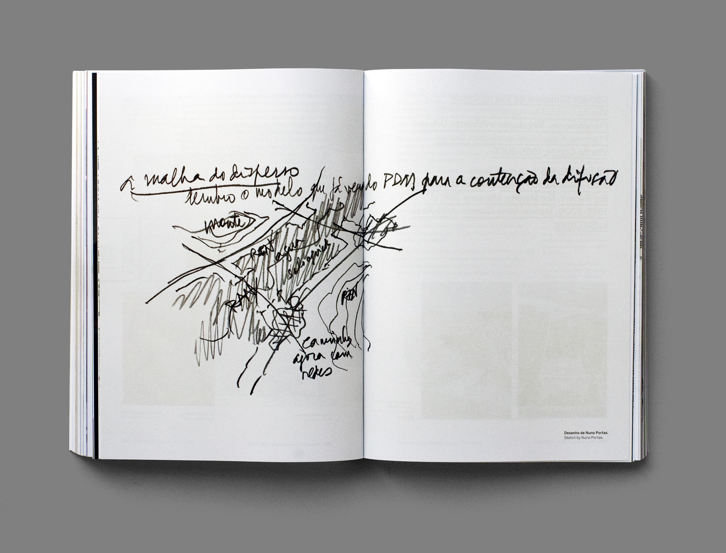
The work of Nuno Portas is rich in its complexity and range. That much was evident when we were confronted with his diverse body of work in the form of an accumulated archive of texts, drawings, plans, cuttings, photos and slides, and an extensive library of reference books. But this was not in my mind simply a documental project. I wanted to reflect his methods and outlook and posture in the world, in short to reflect the complexity of the man as well as his intellectual and practical production. It's here that as designers we are charged with our primary task – regardless of where the content originates – which is to make decisions about how it is delivered, how it is modelled. In short it's where we make decisions about form.
The original idea for the book was for it not to be a book at all but an extensive large-format journal. This was because I had planned that the design of the light tables in the exhibition would be scaled down and 'transported' onto the pages of the journal. In designing the light tables, the idea was that we would be simultaneously be designing the publication, thus saving us precious pagination time.
The best intentions however do not always lead to the best solutions. We discovered that what worked as a three dimensional graphic representation was failing to work when transported to print. A last minute decision meant we had just three weeks to change course and begin working on a book instead. One that we had no idea how many pages it would end up being. In the end it was 640.
In either case it was the intention that the publication conveyed a particular aesthetic which I would describe as a working document; an aesthetic which attempted to reflect qualities and characteristics of the man – clear but not crisp, organised but not ordered, complex but not complicated, diverse, sometimes unpredictable, and above all plural and with depth. And so decisions about visual form followed. A book that was small enough to sit comfortably in your hands – intimate but extensive. A paper stock that deterred preciousness in both its texture and weight. A mix of typefaces (seven in all) and sizes, and treatments, to reflect plurality and epochs and to avoid systemization. A diverse mix of layouts for similar purposes. In all a graphic vocabulary which attempts to reflect a particular type of social and political complexity. Finally, the launch of the book was delayed in order that photos of the exhibition could be included.

Date March 2012
Client Guimarães 2012 – European Capital of Culture
Format 23cm x 16,5cm
Pages 640